
Choosing the perfect neutral paint sometimes feels impossible. Too gray looks cold. Too beige feels dated. You need something just right.
SW Taupe of the Morning might be your answer.
This color from Sherwin-Williams’ Designer Collection has homeowners and designers buzzing. I’ll show you exactly what makes it special.
You’ll learn about its undertones, how lighting affects it, and which rooms work best.
I’ll also share real impressions from people who’ve used it and compare it to other popular neutrals. By the end, you’ll know if Taupe of the Morning suits your home.
What Color Is Taupe of the Morning?
This color doesn’t lean heavily warm or cool. It finds the sweet spot in the middle, making it incredibly versatile for different design styles.
The subtle violet-pink undertone sets it apart from basic beiges. You won’t always see this undertone directly.
It appears to depend on your lighting and surrounding colors. Natural light brings it out more than artificial light.
The Light Reflectance Value (LRV) measures 65, sitting in the medium range. This moderate LRV means rooms feel bright without being stark.
The color adds warmth while maintaining good light reflection. Spaces feel open and airy without losing coziness.
How Taupe of the Morning Looks in Different Lighting
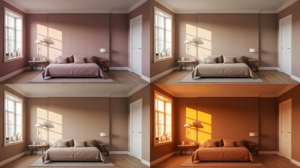
Lighting dramatically changes how Taupe of the Morning appears on your walls throughout the day.
South-Facing Rooms
South-facing rooms receive abundant warm sunlight. Taupe of the Morning glows beautifully in this light and maintains its balance without turning yellow.
The violet-pink undertones stay subtle. This is where the color performs at its best.
North-Facing Rooms
North-facing rooms get cooler, indirect light. Taupe of the Morning adds much-needed warmth to these spaces and prevents them from feeling cold.
The color may appear slightly grayer in northern light with less visible warm undertones.
East- and West-Facing Rooms
East- and west-facing rooms experience dramatic light changes throughout the day. Taupe of the Morning shifts tone as the day progresses, looking warmer in morning light and cooler in the afternoon.
Test it on your walls and watch it through a full day before committing.
Designer and Homeowner Impressions
Real feedback from professionals and homeowners reveals how Taupe of the Morning performs in actual living spaces.
What Interior Designers Say
Interior designers appreciate this color’s flexibility across modern, farmhouse, and transitional interiors.
It creates cozy yet polished spaces and brings warmth without sacrificing style. The violet-pink undertone adds enough interest to keep walls from looking flat.
What Homeowners Are Saying
Homeowners find Taupe of the Morning easy to live with daily. It avoids feeling too cold like grays, or dated like beige.
The color changes depending on lighting and decor, which works for some but feels unpredictable to others. Most appreciate how it coordinates easily with existing furniture.
Real-Life Performance Review
How Taupe of the Morning actually performs on walls, cabinets, trim, and exteriors in real homes.
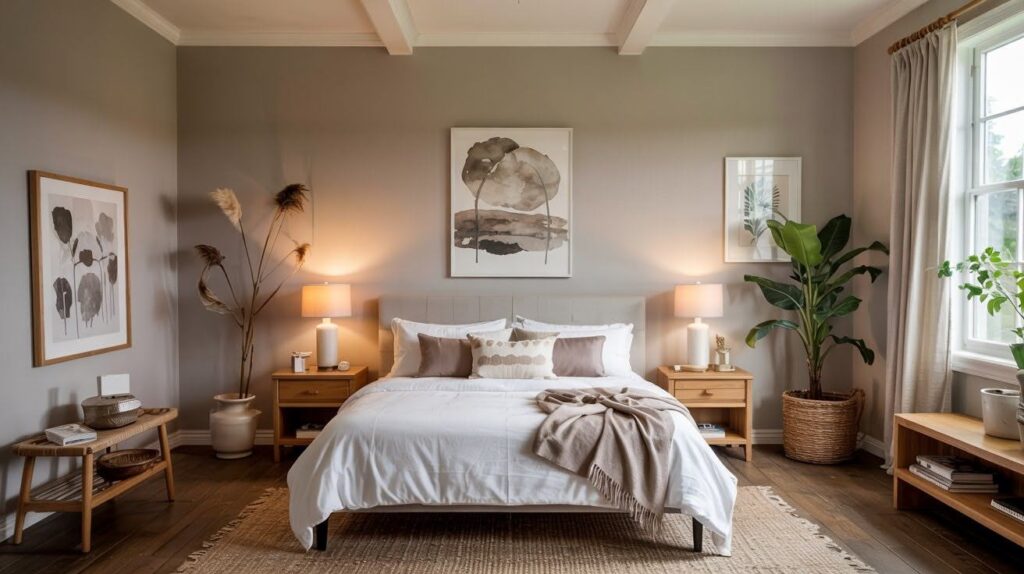
On Walls
Taupe of the Morning creates a smooth, refined finish on walls. It doesn’t overpower your space or compete with furniture and artwork.
The neutral tone lets your decor shine while providing subtle warmth. It works particularly well in living rooms, bedrooms, and hallways.
On Cabinets and Trim
This color adds subtle depth when used on cabinets. Kitchen or bathroom cabinets in Taupe of the Morning look polished and current.
The color pairs beautifully with white countertops and warm metals like brass or gold. Using it on trim creates a softer look than stark white while maintaining definition.
On Exteriors
Taupe of the Morning offers soft neutral curb appeal on home exteriors. The color shifts lighter in bright sunlight, appearing pale and creamy in direct sun versus medium taupe in shadow.
It pairs well with white trim, natural stone, and dark shutters across various architectural styles.
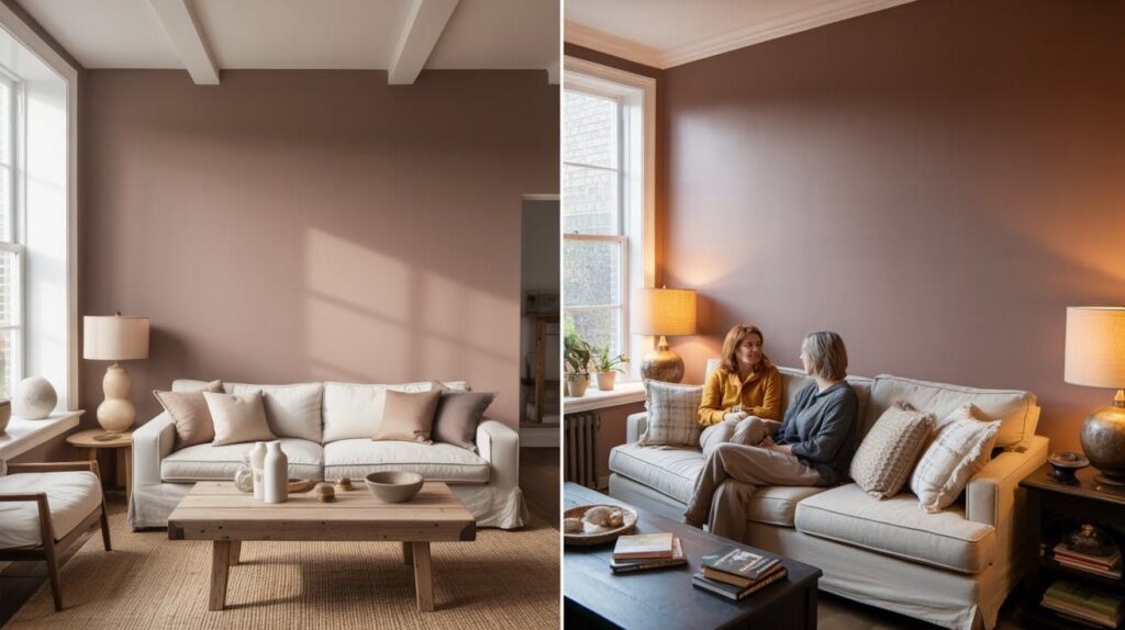
Aesthetic Appeal of Taupe of the Morning
This balanced neutral delivers a refined style that works across multiple design aesthetics and home types.
Balanced Neutral for Modern Homes
Taupe of the Morning offers a soft, calming feel perfect for contemporary and transitional interiors. It brings warmth without looking traditional or outdated.
The color blends warmth and style naturally, creating that effortless, pulled-together look many homeowners want.
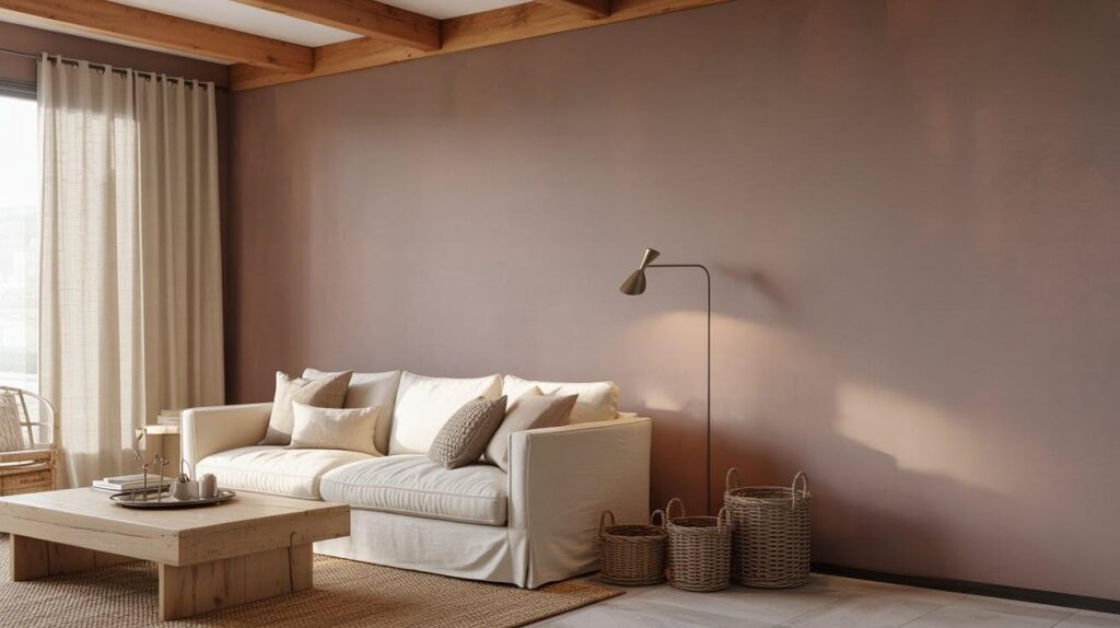
Subtle Undertones That Add Depth
The violet-pink undertones add just enough color complexity. Walls never look flat or one-dimensional.
The undertones shift gently depending on furniture tones and natural light, creating a living, breathing color that responds to its environment.
Works Beautifully Across Styles
This neutral complements modern farmhouse, Scandinavian, and minimalist interiors equally well. It doesn’t commit to one specific aesthetic.
The color pairs gracefully with warm woods, creamy whites, brass fixtures, and matte black accents.
Enhances Texture and Decor
Taupe of the Morning highlights woven textures beautifully. Jute rugs, linen curtains, and woven baskets pop against this backdrop.
Stone accents and neutral fabrics gain definition. Spaces feel polished yet welcoming with a gallery-like quality.
Comparisons with Other Popular Neutrals
Understanding how Taupe of the Morning compares to other favorites helps you make the right choice.
| Color | Undertones | LRV | Temperature | Best For |
| Taupe of the Morning | Violet-pink | 65 | Warm balanced neutral | Softness and warmth across styles |
| Agreeable Gray | Gray-beige | 60 | Cooler neutral | Those preferring cooler tones |
| Edgecomb Gray (BM) | Yellow | Similar | Warmer, more golden | Traditional warm neutrals |
| Modern Gray | True gray | Similar | Cool, crisp | Open-concept, contemporary spaces |
Pros and Cons – Honest Review
Every paint color has strengths and limitations. Here’s the real story on Taupe of the Morning.
Pros
- Adaptable neutral that works across different design styles and lighting conditions without boxing you into one specific classic.
- Creates a cozy yet modern vibe simultaneously, making rooms feel warm and inviting without looking dated.
- Easy coordination with both warm and cool palettes, from brass and wood to chrome and concrete.
- Flexibility makes it practical for changing tastes and simplifies decorating decisions.
Cons
- Undertones shift noticeably in different lights throughout the day, creating unpredictability.
- It may look washed out in very bright rooms without accent colors or layered decor.
- South-facing rooms with massive windows need depth from furniture, artwork, or accent walls.
- Always requires testing samples through a full day to see all variations.
Is Taupe of the Morning Worth Trying?
Overall performance impresses across walls, cabinets, and exteriors. The color delivers consistent quality in small doses or throughout an entire home.
Ideal rooms include living rooms, bedrooms, hallways, and kitchens. It excels where you want warmth without intensity. Bathrooms and dining rooms also benefit from its soft neutrality.
Best design styles include modern farmhouse, transitional, Scandinavian, and contemporary. It fits naturally into these aesthetics without forcing a specific look.
Final verdict: Taupe of the Morning is worth considering. It delivers designer quality without professional help and flatters most homes while remaining practical for everyday living.
Final Thoughts
I have recommended Taupe of the Morning to so many friends this year. They all love how it makes their spaces personalized without forcing a theme.
SW Taupe of the Morning is a designer color that comes with none of the designer trouble. It’s easy, versatile, and beautiful.
Sample it in your space first. Watch it throughout the day. It may change. Listen, it saves you trouble at the end.
Thinking about trying it? I want to see how it looks in your home. Tell us in the comments below if you’ve used this color. Let us know about your experience.
Frequently Asked Questions
What undertones does Taupe of the Morning have?
Taupe of the Morning has subtle violet-pink undertones. These undertones add warmth and complexity without being obvious or overwhelming in most lighting conditions.
Does Taupe of the Morning look gray or beige?
It sits between both, creating a greige appearance. The color leans slightly warmer than pure gray but doesn’t read as traditional beige either.
What LRV is Taupe of the Morning?
Taupe of the Morning has an LRV of 65. This medium reflectance value means it brightens spaces while maintaining warmth and depth.
What white trim goes with Taupe of the Morning?
SW Pure White, Snowbound, or Benjamin Moore Chantilly Lace all pair beautifully. These crisp whites create clean contrast without feeling harsh.
Is Taupe of the Morning good for kitchens?
Yes, it works wonderfully on kitchen walls or cabinets. It pairs beautifully with white countertops, warm wood, and brass or gold hardware.