
The colors on your walls do more than look nice—they shape how you feel and see your space. Paint isn’t just decoration; it’s a tool that affects your emotions and can make rooms feel bigger, smaller, calmer, or more energetic.
In this article, you’ll see how colors affect your emotions and which ones change space perception. You’ll get tips for picking the right colors for each room and simple ways to transform spaces with just paint.
As a color consultant with 15 years of experience, I’ll help you avoid common color mistakes that make rooms feel uncomfortable. With the right professional painting service, you can achieve the same
Also, this article gives you the confidence to choose colors that create exactly the feeling you want in your home.
The Psychology of Color: How Paint Affects Mood
Have you ever felt instantly calm or energized in a room? The wall colors might be why.
I’ve watched paint change not just how spaces look, but how they feel. Colors speak to our brains in subtle ways. They shift our moods, focus, and even hunger.
Notice how fast food places use red and yellow? Or how spas choose blue and green?
As a color consultant, I’ve helped hundreds of homes transform with just paint. You can do it too.
In this guide, I’ll show you what each color does to your mood, which rooms work best with which colors, and how to pick colors that make you feel good at home.
No fancy color theory—just simple facts about how colors affect you and your space.
Let’s find colors that make you feel exactly how you want when you’re home.
How do Paint Colors Influence Spatial Perception?
Want to know a secret? Paint can trick your eyes into seeing a room differently.
I’ve seen tiny rooms seem to double in size with just the right color. And I’ve watched grand spaces turn cozy with a simple shade change.
Light vs. Dark Paint
Light colors open up spaces. When I paint a small room white, cream, or soft blue, it feels bigger right away. Light bounces off these colors and makes the walls seem to pull back.
Try this in your basement or small bedroom. You’ll be amazed at the difference.
Dark colors bring walls closer. They add depth and make spaces feel more intimate. I love using dark navy or forest green in dining rooms where you want a cozy feeling.
But be careful! A small room in dark paint can feel like it’s closing in on you.
Ceiling & Trim Effects
Your ceiling is your “fifth wall,” and it matters a lot.
A white ceiling makes rooms feel taller. I always suggest this if you have low ceilings and feel cramped.
Want your room to feel even bigger? Paint your trim the same light color as your walls. This removes visual stops that can make a room feel boxed in.
But here’s something fun: A dark ceiling can feel cozy and dramatic. In bedrooms, it can be like looking up at the night sky.
Accent Walls & Color Blocking
An accent wall is your best friend for adding depth without going too dark.
I painted just one wall of my narrow living room in a deep color. Now the room feels wider because that wall seems to step back.
Try color blocking to direct attention. Paint the wall behind your bed or sofa in a richer shade. This pulls focus and creates depth without making the whole room feel small.
You can even use color to make hallways feel shorter or longer, depending on which walls you highlight.
The right paint placement can make your rooms feel exactly how you want them—bigger, cozier, taller, or more balanced.
Best Paint Colors by Room Type
Ever walked into a room and felt instantly at ease? Or maybe you felt energized? The right paint can do that. I’ve helped hundreds of homeowners pick colors that work for how they use each space.
Let me share what I’ve learned.
Bedroom
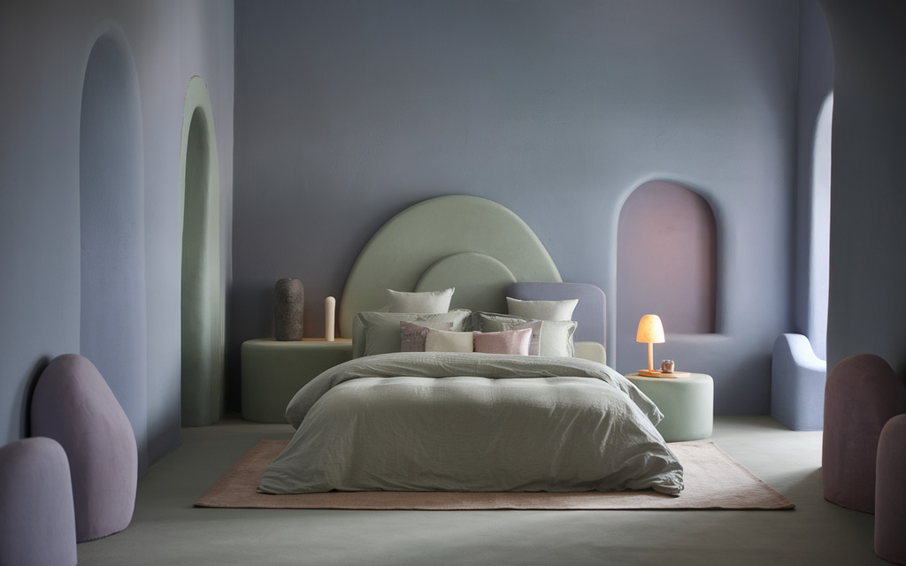
Your bedroom should help you sleep. I recommend cool colors here:
- Soft blues (like faded denim)
- Gentle greens (think sage)
- Muted lavender (not bright purple)
Why? These shades lower your heart rate and calm your mind.
One of my clients painted her bedroom a light blue-gray. She told me she now falls asleep 20 minutes faster than before!
Stay away from bright reds or oranges in bedrooms. They can make your brain too active right when you need to wind down.
Living Room
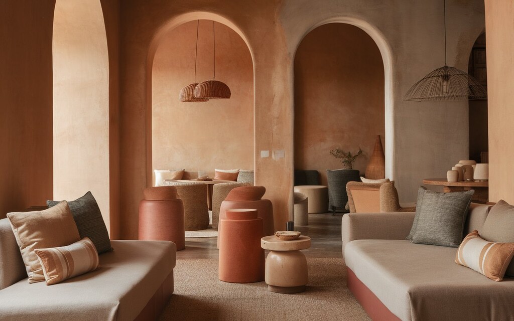
This is where you gather with family and friends. You want it to feel warm and inviting.
I find that warm neutrals work best here:
- Soft tans
- Warm grays
- Earthy tones like terracotta
These colors create a grounding effect that makes people want to sit and stay awhile.
Have you noticed how coffee shops use these colors? They want you to feel comfortable and stick around!
Kitchen
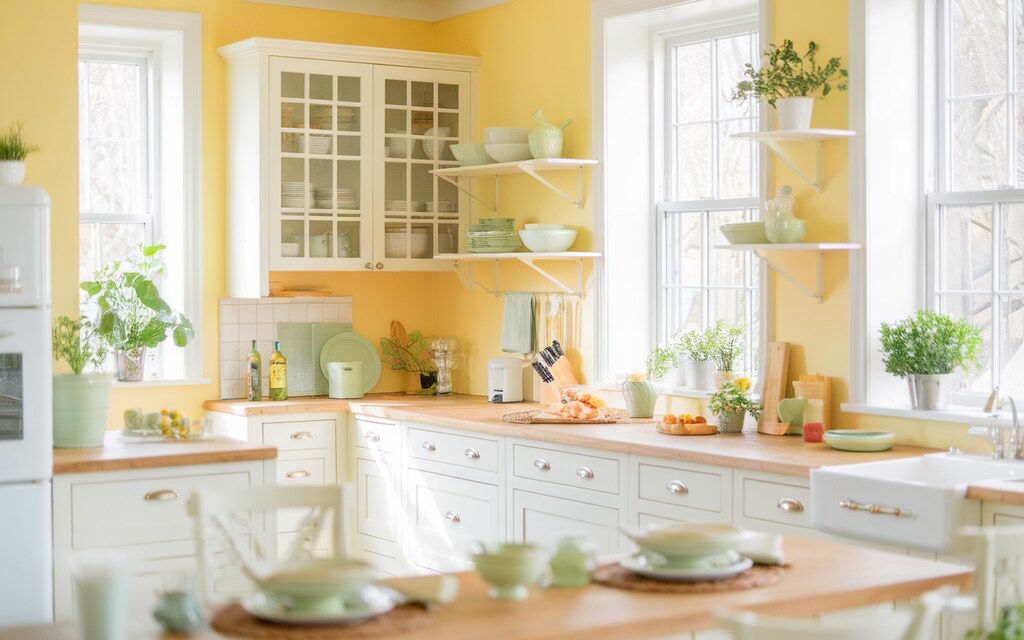
Kitchens need energy. You’re active here, cooking and cleaning.
In my own kitchen, I used a buttercream yellow. It makes the space feel sunny even on cloudy days.
Great kitchen colors include:
- Crisp whites (makes the space feel clean)
- Cheerful yellows (boosts mood)
- Light greens (fresh feeling)
Fun fact: Yellow and red can actually make you feel more hungry! That’s why so many food brands use these colors.
Dining Room
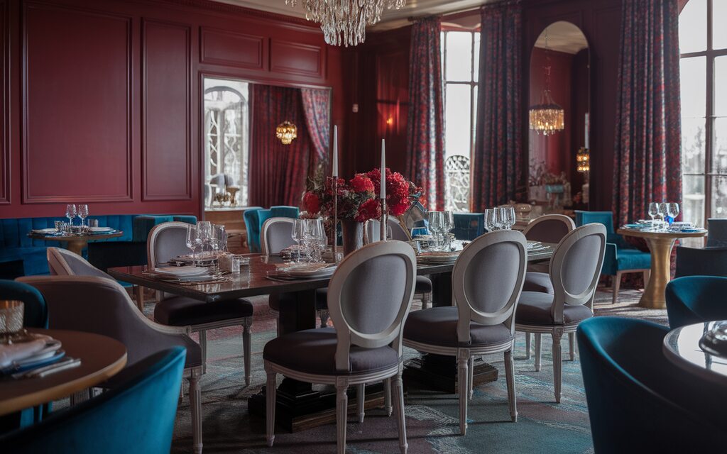
Want a space that encourages good conversation over meals? Go a bit bolder in your dining room.
I love using:
- Deep reds (creates warmth)
- Sophisticated grays (adds elegance)
- Rich blues (feels grown-up)
My favorite dining room I ever designed used a deep garnet red. The family told me they started having longer dinners because the room felt so good to be in!
Home Office
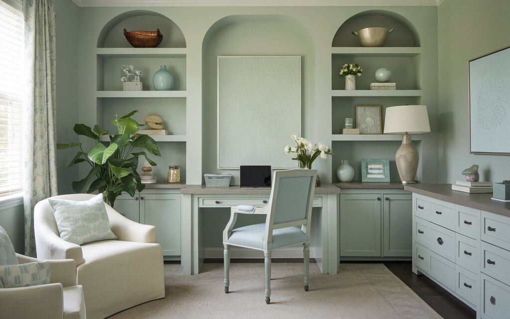
Need to focus? Your office colors matter more than you think.
I work from home too, and painted my office a soft sage green. It keeps me alert without feeling stressed.
Good office colors include:
- Muted greens (reduces eye strain)
- Light blues (improves focus)
- Soft neutrals (create ba ackground calm background)
Skip bright yellows or reds here. They can make it hard to concentrate during long work sessions.
What room are you thinking of painting first? The right color can transform how you use and feel in that space every day.
Tips for Choosing the Right Paint Color
Always test paint samples on your walls. Look at them in morning, afternoon, and evening light for at least 3 days. What looks perfect in the store often surprises you at home.
Pay attention to natural light direction. South-facing rooms get warm, yellow light that intensifies colors. North-facing rooms receive cooler, bluer light that mutes colors. Choose warmer tones for north rooms if you want to add warmth.
Create a flow between rooms. Pick 3-5 colors with similar undertones for your whole home. Each room can be different while still feeling connected.
Trust your feelings. Color psychology provides good guidelines, but your taste matters most. I had a client who used bright orange in her meditation room because it made her happy. Now it’s her favorite space!
What colors have you always loved? That’s often the best place to start.
Conclusion
Paint is more than just a coating on your walls, it’s a powerful tool that shapes how you feel and experience your home. By matching colors to each room’s purpose, you can create spaces that support your daily life and emotional needs.
Remember to test colors in your own space, consider your lighting, and trust your connection to colors. The perfect paint choice balances color psychology with what feels right to you. Your home should be a reflection of who you are, and the right colors help make that possible. Happy painting!
FAQs
How do different paint colors affect your mood?
Colors can evoke specific emotions. For example, blue tends to promote calm and focus, yellow encourages happiness and energy, and red can stimulate passion or appetite. Choosing the right color depends on the mood you want to create in a space.
What colors make a room feel bigger and brighter?
Light paint colors such as soft whites, pastels, and pale neutrals reflect more light and can make a room feel larger and more open. Using a consistent color on walls and trim can also enhance the feeling of spaciousness.
Can dark paint colors make a room feel smaller?
Yes, darker colors absorb light and can make a room feel more enclosed or cozy. However, when used strategically on an accent wall or with good lighting, they can add depth and sophistication without overwhelming the space.
Which paint colors are best for reducing stress at home?
Cool tones like soft blues, greens, and lavender are ideal for stress relief. They evoke a sense of calm and are often used in bedrooms, bathrooms, or relaxation areas.
Is it okay to use bold or bright paint colors in small rooms?
Absolutely! Bold colors can make a small space feel vibrant and intentional. The key is to balance using accent walls, keep trim light, and pair bold colors with neutral decor to avoid visual clutter.
What’s the best color for boosting productivity in a home office?
Muted blues and greens are commonly used in home offices as they enhance focus, reduce eye strain, and promote a calm working environment. Avoid overly stimulating colors like red in focus-heavy spaces.