
This warm versatile shade is favored now by homeowners and designers. That warm brown works well anywhere since it makes a cozy feeling.
This guide shall teach you the winning color combinations. This also describes ideal room uses for that like neutral.
Its light reflectance value as well as undertones along with key mistakes when using it will be covered by me.
Many people pick this color and you’ll know the reason later. This reliable color in their homes is perfect. Your go-to paint choice, it just might become that also.
What is Tapestry Beige, Benjamin Moore?

Tapestry Beige is a balanced light greige that adapts beautifully to different lighting conditions. This versatile shade can lean warm or cool depending on your room’s natural light and surrounding colors.
You’ll also see it labeled as OC-32. The “OC” stands for Off-White Collection, which tells you it’s in that perfect neutral zone.
This color belongs to Benjamin Moore’s Classics® Collection. These are their tried-and-true shades that have stood the test of time. Think of them as the reliable favorites that rarely go out of style.
The beauty of Tapestry Beige lies in its flexibility. It works as a main wall color or as a backdrop for bolder accent pieces.
The Undertones of Tapestry Beige
The magic of Tapestry Beige lies in its subtle green undertone. This green base keeps the color from looking flat or boring. It also prevents that muddy look some beiges can have.
How does it compare to other popular neutrals?
White Sand leans pink, giving rooms a warmer, more traditional feel. Tapestry Beige feels fresher and more contemporary thanks to that green hint.
Repose Gray sits on the cooler side with gray undertones. Tapestry Beige bridges the gap between warm and cool, making it more flexible.
Why undertones matter so much
Your undertones need to work with what’s already in your room. Got honey oak floors? That green undertone in Tapestry Beige won’t clash. Have cool granite countertops? This color adapts without fighting against them.
Ignore undertones and you might end up with a room that feels off, even if you can’t pinpoint why.
Where Tapestry Beige Benjamin Moore Works Best
Explore the ideal rooms and spaces where this versatile neutral paint color performs beautifully and creates the perfect atmosphere.
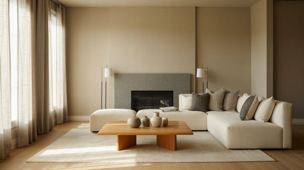
Living Rooms
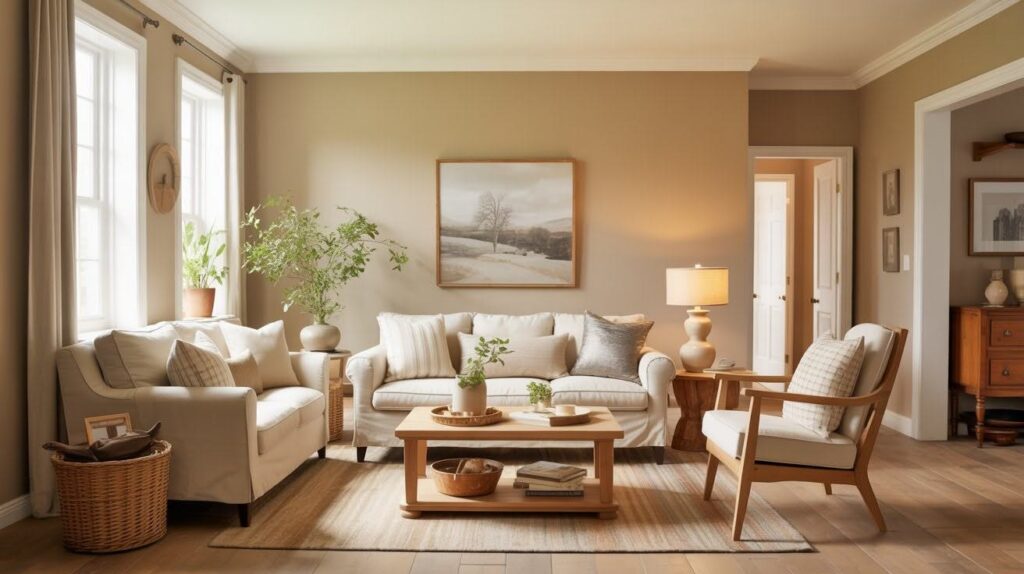
This color makes an excellent backdrop for your main living space. It works beautifully with natural wood furniture and crisp white trim.
The result? A warm, welcoming room that feels put-together without trying too hard.
Bedrooms
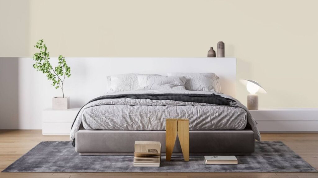
Need a calm, restful space? Tapestry Beige delivers. It pairs perfectly with oak flooring and soft linens.
The subtle green undertone keeps things serene while the beige base adds warmth for better sleep.
Hallways & Entryways
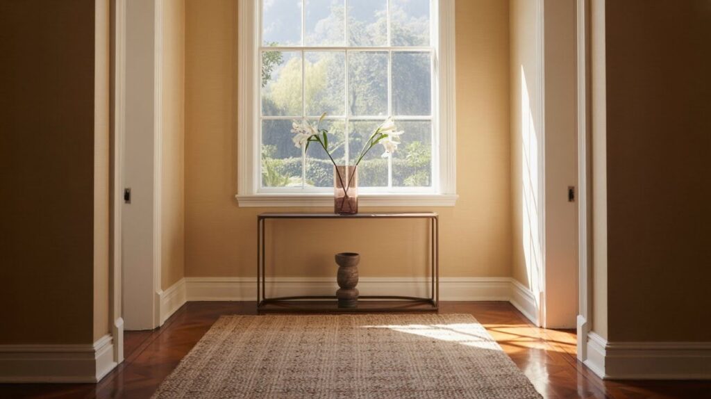
These spaces see different light throughout the day. Tapestry Beige handles these changes gracefully. It’s neutral enough to flow between rooms without competing with other colors.
Perfect for those tricky transition areas where you need something that plays well with everything.
The key is this color’s ability to feel consistent across different lighting conditions and times of day.
When to Avoid Tapestry Beige
Skip Tapestry Beige in open concept homes that already feature neutrals with pink undertones, as the green base will create an awkward clash.
This color also struggles in spaces with fixed elements like cherry wood floors, red-toned cabinets, or warm granite countertops since the green undertones fight against these warmer tones.
For exteriors, choose something else entirely. Tapestry Beige tends to wash out in bright outdoor light and can appear like pale greenish white, losing all its indoor warmth and appeal.
Always consider your existing elements before committing to this shade.
Tapestry Beige Benjamin Moore for Exteriors
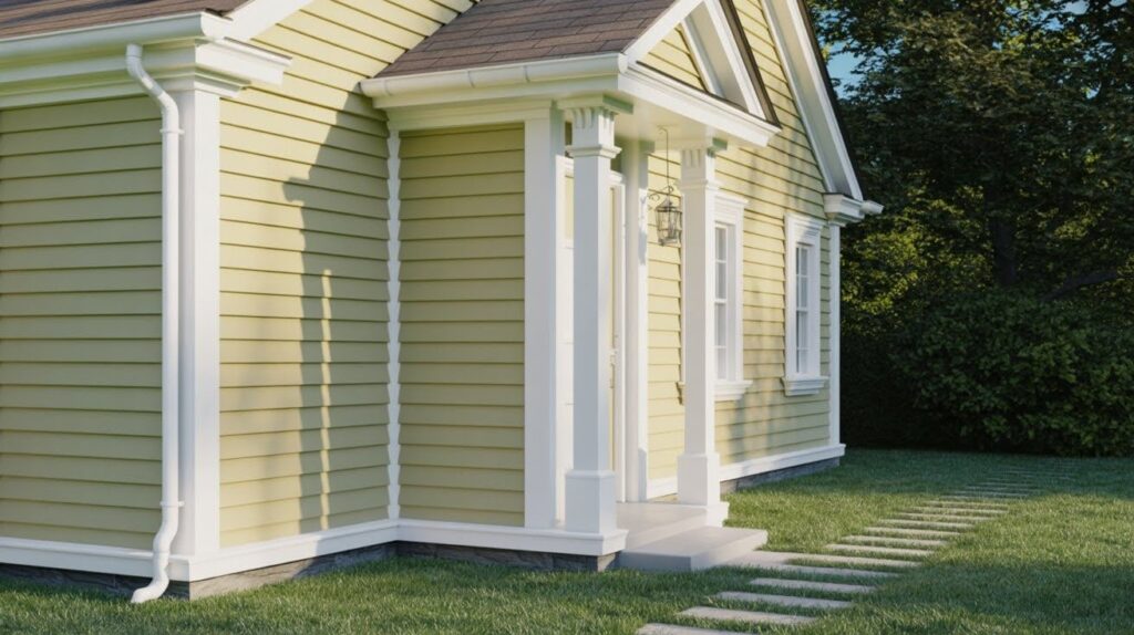
Tapestry Beige struggles outdoors. Its Light Reflectance Value causes it to wash out in bright sunlight, often appearing pale and unintentionally green.
Better exterior choices include Coastal Fog or Mosaic Tile from Benjamin Moore. These colors maintain their warmth and character in outdoor conditions.
If you must use Tapestry Beige outside, pair it with bright white trim like Chantilly Lace or White Dove. The contrast helps, but test a large sample first. What works indoors doesn’t always translate to exteriors.
Best White Paints to Pair with Tapestry Beige
- Chantilly Lace (OC-65): gives you a crisp, bright white that creates clean contrast. Perfect for trim work when you want sharp, defined lines.
- Simply White (OC-117): offers a warm, soft white that feels gentle next to Tapestry Beige. Great for ceilings or areas where you want subtle contrast.
- White Dove (OC-17): strikes the perfect balance. It provides contrast without feeling stark or harsh. This pairing feels natural and relaxed.
- Mascarpone (AF-20): works beautifully when you have warm fixed elements like honey oak floors or wood cabinets. The creamy tone bridges warm and neutral perfectly.
- Dover White (SW 6385): from Sherwin-Williams handles spaces with orange undertones in flooring or furniture. It complements rather than clashes with those warmer tones.
Choose based on your room’s existing elements and the mood you want to create.
Styling Tips for Using Tapestry Beige
- Works beautifully in French Country and classic interiors where warmth and sophistication matter
- Add linen, wood, stone, and natural textures to bring out the color’s complexity and prevent flat-looking spaces
- Choose bronze, gold, or black hardware for beautiful contrast – bronze feels traditional, gold adds richness, black provides modern appeal
- Layer different textures to keep rooms interesting – smooth walls with rough natural elements work perfectly
- Mix finishes intentionally to make Tapestry Beige feel purposeful rather than plain
Conclusion
Assortment Beige by Benjamin Moore shows neutrals are not all the same. Those very subtle green undertones do set it apart from more boring beiges.
As a result of this, it creates a backdrop that is advanced for any room.
Stay within interior spaces because this color excels indoors but struggles outdoors. Test samples within your room prior to the final decision.
This versatile neutral could be exactly what you’ve been searching for if you love classic palettes as well as earth tones.
It functions along with the listed elements, so decoration is, in fact, easier. It also suits most different styles.
Frequently Asked Questions
Is Tapestry Beige a warm or cool color?
Tapestry Beige is a balanced neutral that can lean either warm or cool depending on your lighting and surrounding colors. The subtle green undertones help it adapt to different room conditions without clashing.
What LRV does Tapestry Beige have?
Tapestry Beige has a Light Reflectance Value that makes it suitable for most interior spaces. This moderate LRV means it won’t feel too dark or overwhelmingly bright in standard room lighting.
Does Tapestry Beige work with oak flooring?
Yes, Tapestry Beige pairs beautifully with oak flooring. The green undertones complement the natural wood tones without creating any awkward color clashes.
Can I use Tapestry Beige in a small room?
Absolutely, this color works well in smaller spaces. Its light nature helps rooms feel open while the warm undertones prevent that cold, sterile feeling some neutrals create.
What’s the difference between Tapestry Beige and Agreeable Gray?
Tapestry Beige has green undertones while Agreeable Gray leans more purple-gray. Tapestry Beige feels warmer and more traditional, while Agreeable Gray appears cooler and more contemporary.