
Dark green paint colors have become incredibly popular in modern interior design, offering a fresh alternative to neutral tones while bringing natural warmth and depth to any space.
These rich, moody shades create dramatic focal points and work beautifully in both traditional and contemporary settings.
Among the standout options available today, Benjamin Moore’s Vintage Vogue 462 stands out as a particularly sophisticated choice.
This timeless dark green combines classic appeal with modern sensibility, making it perfect for homeowners seeking to create spaces that feel both current and enduring.
With its balanced undertones and versatile nature, Vintage Vogue 462 transforms ordinary rooms into extraordinary environments that reflect personal style and refined taste.
What is Vintage Vogue by Benjamin Moore?
Learn about this sophisticated dark green paint’s unique characteristics, undertones, and light reflectance properties.
Color Overview
Vintage Vogue 462 is a deep, earthy green that strikes the perfect balance between boldness and subtlety.
This complex color features rich gray and brown undertones that prevent it from appearing too bright or overwhelming.
Its sophisticated composition makes it incredibly versatile, working seamlessly in both modern minimalist spaces and classic traditional homes.
The color brings natural warmth to interiors while maintaining an air of refinement that appeals to contemporary design sensibilities.
LRV (Light Reflectance Value)
Light Reflectance Value measures how much light a color reflects, with higher numbers indicating lighter colors.
Vintage Vogue’s LRV of 11.85 places it firmly in the dark color category, meaning it absorbs most light rather than reflecting it.
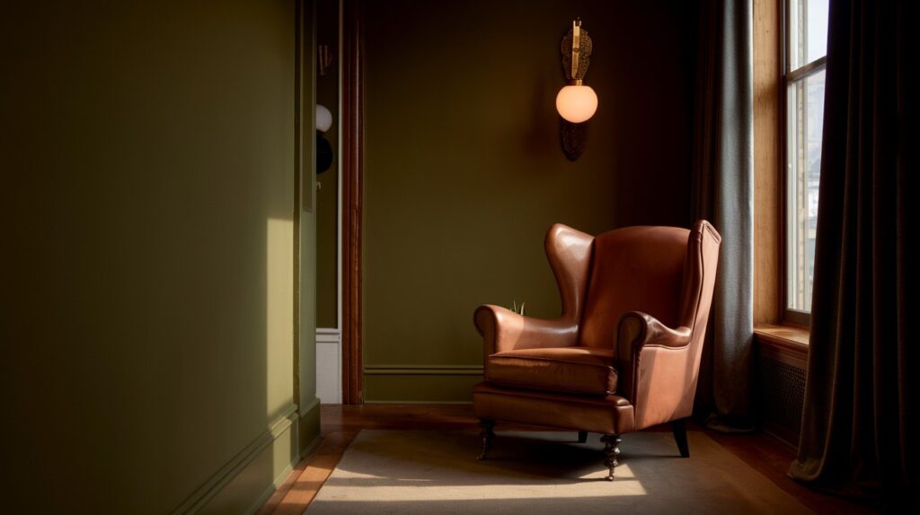
In practical terms, this creates intimate, cozy atmospheres but requires careful consideration of lighting and room size.
Spaces painted in colors with low LRV ratings benefit from ample natural light or well-planned artificial lighting to prevent them from feeling too closed-in.
Undertones Explained
The beauty of Vintage Vogue lies in its complex undertone structure. Green forms the base, while black adds depth and sophistication.
Brown undertones provide earthiness and warmth, preventing the color from feeling cold or sterile.
Subtle yellow influences keep it from becoming too somber.
This careful balance creates a muted, grounded appearance that feels organic rather than artificially vibrant.
The result is a color that shifts subtly throughout the day as lighting conditions change.
Where to Use Vintage Vogue in Your Home
Explore ideal interior and exterior applications, from kitchen cabinets to accent walls and lighting considerations.
Best Interior Applications
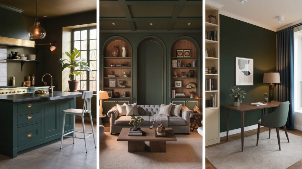
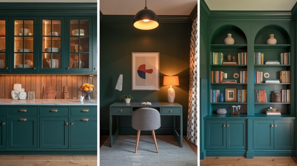
Kitchen Cabinets and Islands: Vintage Vogue transforms kitchen cabinetry into statement pieces that feel both current and timeless. It works particularly well on kitchen islands, creating dramatic focal points that anchor the space.
Living Room Walls or Built-ins: This color creates striking accent walls that add personality without overwhelming the room. Built-in bookcases or entertainment centers painted in Vintage Vogue become architectural features that blend function with style.
Accent Walls and Offices: Home offices benefit from this color’s calming yet focused energy. A single accent wall can transform a mundane workspace into an inspiring environment that promotes concentration and creativity.
Lighting Considerations
Natural and artificial lighting significantly impact how Vintage Vogue appears in your space. In rooms with abundant natural light, the color reveals its full complexity and richness.
North-facing or east-facing rooms may cause the color to appear darker or shift toward its cooler undertones.
Consider adding warm artificial lighting through table lamps, sconces, or overhead fixtures to maintain the color’s intended warmth and depth throughout the day.
Using Vintage Vogue on Exteriors
Vintage Vogue creates exceptional curb appeal when used on exterior surfaces.
Its natural, earthy quality pairs beautifully with organic materials like wood siding, stone foundations, or brick details.
The color works particularly well on front doors, shutters, or as full exterior paint, creating homes that feel connected to their natural surroundings while maintaining sophisticated appeal.
Coordinating Colors and Materials
Find perfect trim colors, accent shades, and complementary materials to create cohesive, beautiful spaces.
Trim Color Suggestions
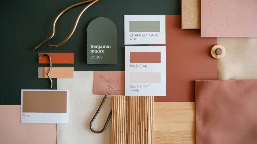
High-Contrast Whites: Create dramatic definition with crisp whites like Chantilly Lace, Simply White, or White Dove. These bright whites make Vintage Vogue appear richer and more defined.
Low-Contrast Options: For subtler contrast, consider Pale Oak, Swiss Coffee, or Light Pewter. These softer neutrals create gentle transitions that feel more organic and less stark.
Monochromatic Look: Paint trim in the same Vintage Vogue color for a seamless, contemporary appearance that emphasizes architectural lines without creating visual breaks.
Ideal Accent Colors
Warm Earth Tones: Clay and terracotta colors complement Vintage Vogue’s natural qualities, creating spaces that feel grounded and harmonious.
Complementary Neutrals: Soft taupe and warm beige provide gentle contrast while maintaining the overall calm atmosphere that Vintage Vogue creates.
Textures and Finishes: Enhance the color with materials like brass and copper hardware, bamboo furnishings, and natural linen textiles. These organic elements amplify the paint’s inherent warmth and earthiness.
Color Comparison: Vintage Vogue vs. Other Dark Greens
Side-by-Side Comparisons
|
Color Name |
Brand |
Key Differences from Vintage Vogue |
|
Vintage Vogue |
Benjamin Moore |
Base reference – deep green with gray and brown undertones |
|
Dark Olive |
Benjamin Moore |
More yellow undertones, warmer and less sophisticated |
|
Backwoods |
Benjamin Moore |
Darker overall, more black undertones, less green visible |
|
Boreal Forest |
Benjamin Moore |
Cooler undertones, more blue-green, less earthy feel |
|
Dakota Shadow |
Benjamin Moore |
Grayer appearance, less green saturation, more neutral |
|
Chimichurri |
Benjamin Moore |
Brighter and more vibrant, less muted than Vintage Vogue |
|
Hunter Green |
Various Brands |
Traditional forest green, more intense and less complex |
Sherwin-Williams Alternatives
|
Sherwin-Williams Color |
Comparison to Vintage Vogue |
|
Pewter Green |
Similar muted quality but slightly cooler undertones |
|
Forestwood |
Comparable depth and earthiness with slightly more brown influence |
These comparisons help identify the unique qualities that make Vintage Vogue stand out among dark green options.
Its balanced undertones and sophisticated appearance distinguish it from both brighter and darker alternatives in the green color family.
Real-Life Inspiration
Vintage Vogue in Real Homes
Kitchen from The Trebleo House: This kitchen features Vintage Vogue on all cabinetry, creating a bold yet warm cooking space. The dark green cabinets anchor the room while maintaining an inviting atmosphere.
Accent Wall in Mark & Torrey Bishop’s Office: A single accent wall painted in Vintage Vogue transforms this home office into a focused workspace. The deep green creates visual interest without overwhelming the small room.
Built-ins by Thrifty Decor Chick: Custom shelving painted in Vintage Vogue turns ordinary storage into a design feature. The color adds character to functional built-in units.
How Styling Choices Affect the Color
Vintage Vogue looks different depending on what you pair it with. Light countertops make the green appear richer and more dramatic.
Natural wood brings out its earthy qualities and creates a warm, balanced feel. Wallpaper patterns can either blend softly with the paint or create bold contrast.
These choices show how the same color can work in many different styles and moods.
Conclusion
Vintage Vogue 462 by Benjamin Moore offers homeowners an exceptional opportunity to create spaces that feel both cozy and refined.
This sophisticated dark green brings natural warmth and depth to any room while maintaining the versatility to work across various design styles.
Its complex undertones and balanced composition make it a standout choice for those seeking to move beyond basic neutrals without sacrificing timeless appeal.
Before committing to this transformative color, test it in your specific space and lighting conditions.
Consider exploring the coordinating palettes and material combinations discussed to create a cohesive design that reflects your personal style.
With thoughtful planning and careful consideration of complementary elements, Vintage Vogue can transform your home into a space that feels both current and enduring.
Frequently Asked Questions
What makes Vintage Vogue different from other dark green paints?
Vintage Vogue features complex gray and brown undertones that create a muted, sophisticated appearance. Unlike brighter greens, it feels grounded and works well in both modern and traditional spaces.
Can I use Vintage Vogue in small rooms?
Yes, but consider the lighting carefully since it has a low LRV of 11.85. Add plenty of artificial lighting and pair with light-colored furnishings to prevent the space from feeling too dark.
What trim colors work best with Vintage Vogue?
High-contrast whites like Chantilly Lace create dramatic definition, while softer options like Pale Oak offer subtle contrast. You can also paint trim the same color for a contemporary monochromatic look.
Is Vintage Vogue suitable for exterior use?
Absolutely, it creates excellent curb appeal and pairs beautifully with natural materials like wood and stone. The earthy quality makes it perfect for front doors, shutters, or full exterior applications.
How does lighting affect Vintage Vogue’s appearance?
The color can appear darker in north-facing rooms and shifts throughout the day as natural light changes. Warm artificial lighting helps maintain its intended richness and prevents it from looking too cool.