
Selecting the right paint color can feel overwhelming. You want something dark in contrast but you do not want something too dark. Something advanced, but livable.
Look no further than Sherwin-Williams Sea Serpent for inspiration.
This moody navy color has become a favorite with both homeowners and designers, and in this article, I’ll show you everything about SW 7615.
You will learn how to tell its undertones. You will also learn about how lighting will affect the color and which colors complement it.
I’ll also show you how to use it within your home and what finishes work best. Hopefully, you will know if Sea Serpent is a fit by the end of this post. This should give you a better idea.
Is Sherwin-Williams Sea Serpent a Neutral Color?
Sea Serpent sits in an interesting category. It’s a dark navy that functions as a modern neutral. Think of it as the new alternative to gray or beige.
Dark navies have become go-to neutrals. They offer depth without the starkness of black. Sea Serpent fits this role perfectly. Compared to traditional grays, it brings more personality while remaining versatile.
Designers love this shade because it balances boldness with sophistication. You get impact without sacrificing livability. The color feels serious but not stuffy.
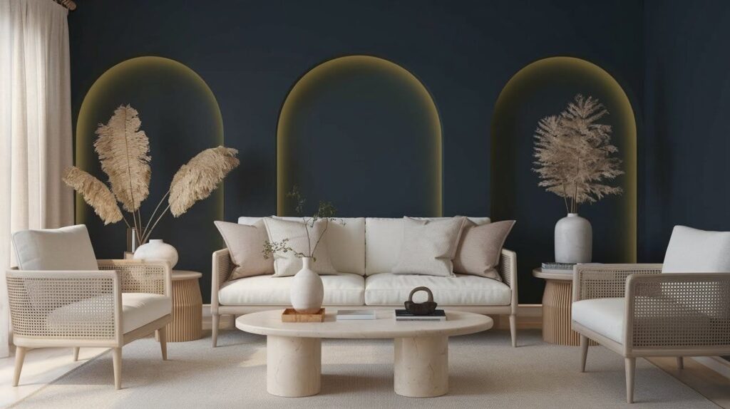
Sea Serpent works across multiple interior styles. It fits coastal homes, modern farmhouses, and contemporary spaces equally well.
This versatility makes it function like a true neutral. The mood it creates is calm yet confident, adding drama while maintaining a sense of calm.
Sherwin-Williams Sea Serpent Color Specifications
Understanding Sea Serpent’s technical details helps predict how it will look in your specific space.
LRV (Light Reflectance Value)
The Light Reflectance Value (LRV) sits around 6. This number tells you how much light the color reflects. Lower numbers mean darker colors. At LRV 6, Sea Serpent is quite dark.
This low LRV means lighting becomes crucial. In bright rooms with lots of windows, it looks rich and moody. In dim spaces with little natural light, it can feel very dark. Test it in your actual room before committing.
Undertones and Color Characteristics
The undertones make this color special. Sea Serpent has a blue-gray base. You’ll also catch subtle green undertones depending on the light. These undertones shift throughout the day.
Under warm lighting, the green tones become more visible. The color can look almost teal in certain conditions. Under cool light, the blue-gray dominates. It appears more traditionally navy.
Natural daylight brings out the truest version. You’ll see the complexity of the color best during midday. Artificial warm bulbs push it toward the green side.
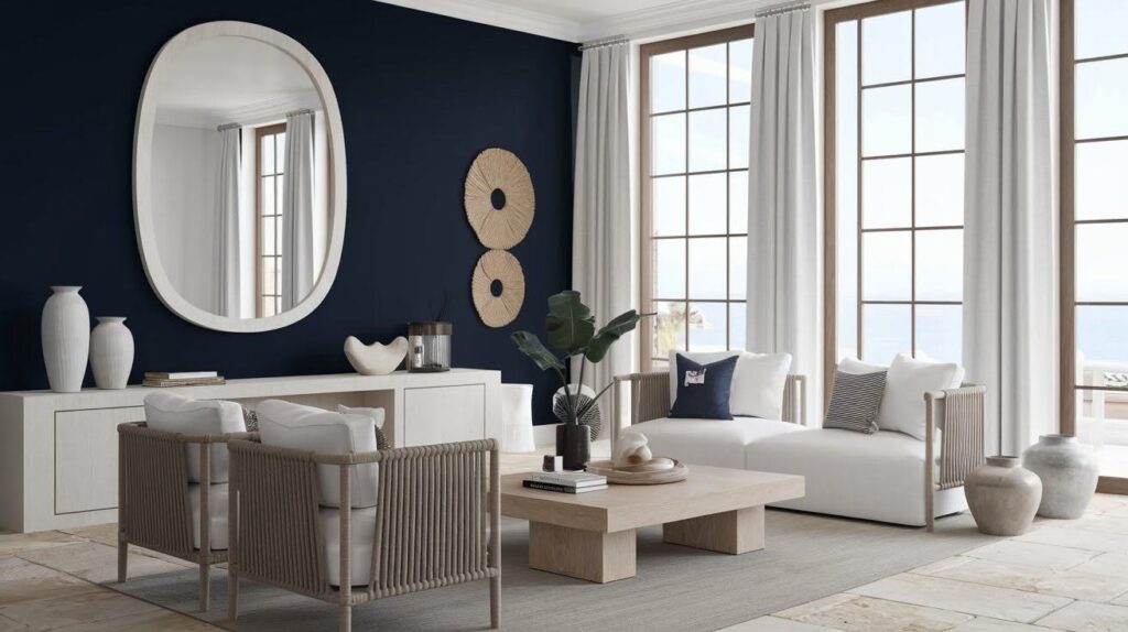
Coordinating and Complementary Colors
Pairing Sea Serpent with the right colors creates a cohesive, polished look throughout your home.
Best Sherwin-Williams Pairings

Sherwin-Williams offers several perfect companions. Ice Cube (SW 6252) provides a crisp, clean white that brightens spaces.
Lullaby (SW 9136) offers a soft, warm neutral for balance. Uncertain Gray (SW 6234) works beautifully as a lighter transition shade.
Building a palette with these colors is straightforward. Use Sea Serpent as your anchor color. Add an Ice Cube for trim, ceilings, or adjacent walls. Layer in Uncertain Gray for spaces that need something lighter but still connected.
Accent Colors That Work Well
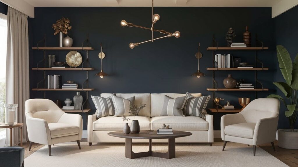
Accent colors bring the palette to life. Warm metallics like brass and gold look incredible against Sea Serpent’s dark base. The warmth of these metals prevents the space from feeling cold.
Natural wood tones work beautifully, too. Light oak, walnut, and maple all complement the navy without competing. Keep other neutrals simple. Cream, tan, and soft gray add warmth without distraction.
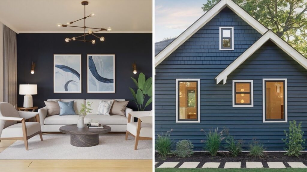
Where to Use Sherwin-Williams Sea Serpent
Sea Serpent works in multiple locations throughout your home, both inside and out.
Interior Applications
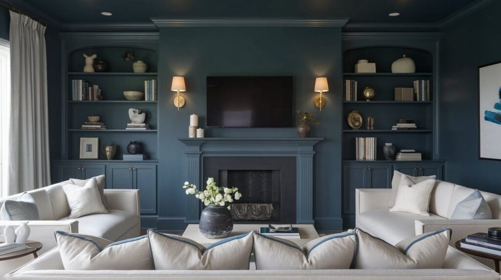
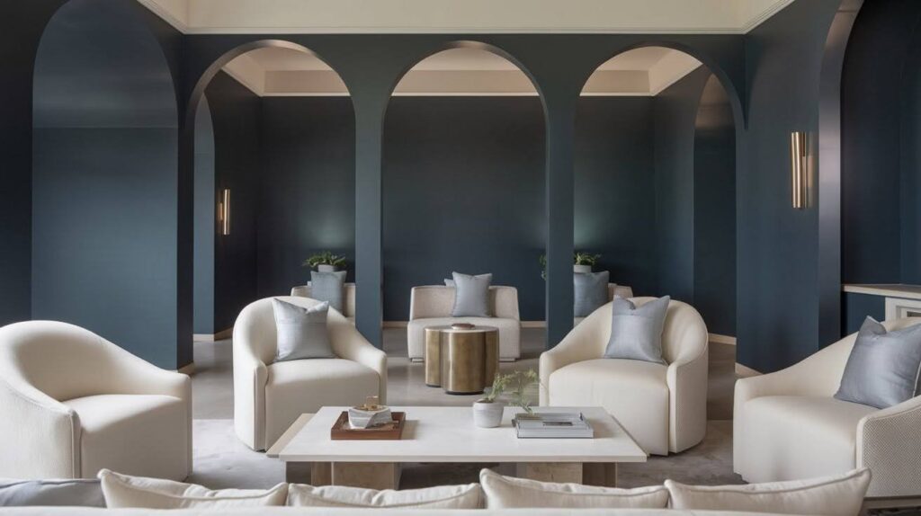
Living rooms become instantly polished with Sea Serpent on the walls. Bedrooms feel cozy and restful. Kitchens gain personality from lower cabinets or islands.
Accent walls create focal points without overwhelming spaces. Cabinet painting changes kitchens and bathrooms completely. Trim and built-ins gain definition and character with this rich navy.
Exterior Applications

Sea Serpent on the siding creates a modern, confident look. Shutters in this color pop against white or light-colored homes. Front doors painted in Sea Serpent become instant focal points.
Pair it with stone and brick for incredible contrast. White trim provides crisp definition. Light gray siding with Sea Serpent accents creates a refined two-tone effect.
Lighting and Finish Considerations
How your room receives light dramatically changes how Sea Serpent appears on your walls.
How Lighting Affects the Shade
North-facing rooms receive cooler, indirect light. Sea Serpent leans more blue-gray and can feel quite cool and dark. South-facing rooms get warm, direct sunlight where green undertones emerge more strongly.
Daylight shows the color’s true complexity with both blue and green notes visible. Warm bulbs (2700K-3000K) bring out green tones. Cool bulbs (4000K+) emphasize the blue-gray.
Recommended Paint Finishes
For interior walls, matte or eggshell finishes work best. Matte hides imperfections and creates a velvety look. Eggshell offers a slight sheen while remaining easy to clean.
For exterior use, choose satin or semi-gloss finishes. These withstand the weather better and are more durable. Semi-gloss works well on doors and trim where you want a slight shine.
Design Inspiration and Style Pairings
Sea Serpent adapts beautifully to multiple design styles while maintaining its polished character.
Interior Design Styles That Love Sea Serpent
Coastal interiors love this navy for its ocean reference without the cliche. Pair it with white, natural rope textures, and light wood for a refined beach house feel.
Modern farmhouse style contrasts beautifully with shiplap, white cabinetry, and rustic wood. Contemporary homes benefit from using it with concrete, metal accents, and minimal decor.
Real-Life Styling Ideas
Kitchen cabinets in Sea Serpent create instant impact. Lower cabinets in this shade with white uppers balance light and dark perfectly. Bedroom accent walls set a calming mood while built-in bookshelves add depth.
Bathroom vanities gain personality without overwhelming small spaces. Combine Sea Serpent with white bedding, light rugs, and pale artwork to prevent heaviness.
Natural materials like jute, linen, and light wood keep the look balanced.
Final Thoughts
My friends have received many recommendations for Sea Serpent from me. It’s one of those colors that works harder for you than you’d expect.
Sherwin-Williams Sea Serpent is advanced without being a boring neutral. It can also create a moody vibe without feeling too small or closed in. Most people are completely taken aback.
Try it out within your space. See how it looks in the morning. View it at nighttime. Trust me, this color looks completely different under the light.
Ready to try it? Grab a sample pot this weekend. Let me know in the comments how it looks in your home, or what you experienced.
Frequently Asked Questions
What color is Sherwin-Williams Sea Serpent?
Sea Serpent (SW 7615) is a dark navy with blue-gray undertones and subtle green notes. It functions as a sophisticated neutral in modern interiors.
Does Sea Serpent look black?
No, Sea Serpent reads as a rich navy rather than black. In good lighting, you’ll clearly see its blue and green undertones, distinguishing it from true black.
What colors go with Sea Serpent?
Crisp whites like Ice Cube, soft grays like Uncertain Gray, and warm neutrals pair beautifully. Brass, gold, and natural wood tones create excellent accents.
Is Sea Serpent good for a bedroom?
Yes, Sea Serpent creates a cozy, restful atmosphere in bedrooms. Balance it with white bedding and light decor to prevent the space from feeling too dark.
What is the LRV of Sea Serpent?
Sea Serpent has an LRV of around 6, making it quite dark. Consider your room’s natural light before committing to this shade on all walls.