
Have you ever stepped into a room with a bold orange accent wall and instantly felt your energy spike? Or thrown on that bright red blazer and suddenly stood a little taller?
That’s saturated colors doing their thing, and honestly, it’s pretty incredible how they work on us.
These aren’t your muted, whispered tones. Saturated colors are pure, intense, and unapologetically bold. They’re packed with pigment and zero patience for being ignored. Whether you love them or find them intimidating, you definitely notice them.
Here’s what I’ve learned: understanding saturated colors changes everything about how you approach decorating, getting dressed, or even designing digital spaces.
I’m excited to share what really works (and what totally doesn’t) when it comes to these powerhouse hues. Ready to jump in?
What Are Saturated Colors?
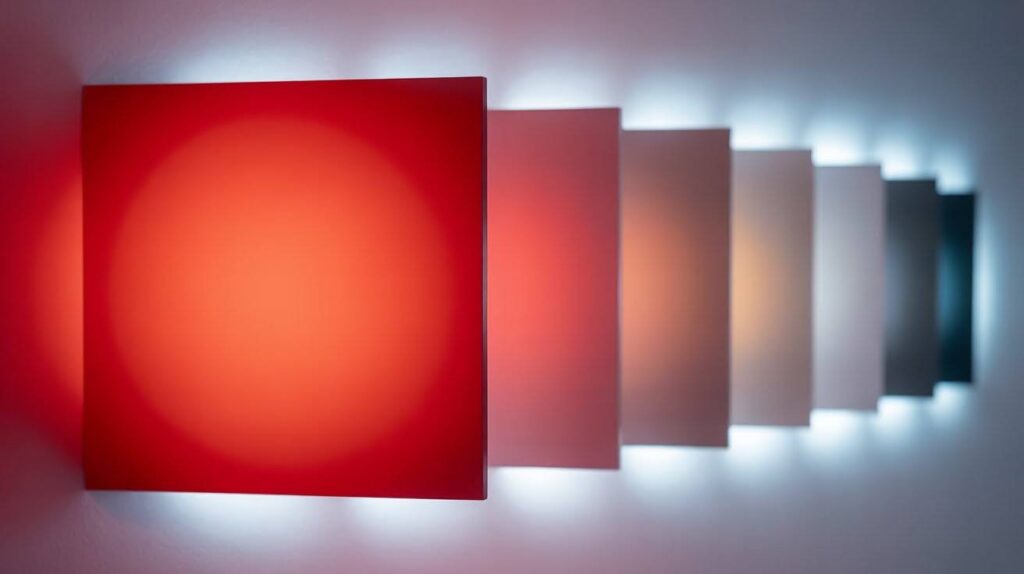
Saturated colors are pure, intense hues with maximum color strength and minimal dilution from gray or white tones.
Think of saturation like the volume control on your music player. High saturation cranks up the color intensity to maximum volume. Low saturation turns it down to a whisper.
A fire engine red has high saturation. It’s bold and grabs attention instantly. That same red mixed with gray becomes muted and soft. That’s low saturation at work.
Saturation works hand in hand with hue and value. Hue is the color family like red or blue. Value refers to how light or dark the color appears. Together, these three elements create every color you see.
The Science Behind Saturation
Understanding color models helps you work with saturation more effectively in different mediums and applications.
Additive color models work with light sources like computer screens. They mix red, green, and blue light to create colors. Subtractive models work with pigments like paint. They absorb certain wavelengths and reflect others.
The HSV model breaks color into three parts. Hue determines the color family. Saturation controls the intensity. Value adjusts the brightness. This system makes it easy to understand how colors relate to each other.
Saturation and chroma are similar but different. Saturation describes color intensity relative to brightness. Chroma measures the pure color content regardless of lighting conditions.
The Emotional Impact of Saturated Colors
Highly saturated colors trigger strong emotional responses and can dramatically change how spaces feel.
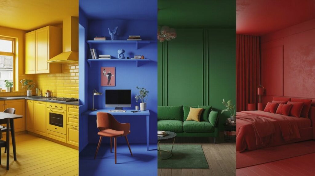
These bold hues energize rooms and lift spirits instantly. A saturated yellow kitchen makes morning coffee time feel more cheerful. Bright blue walls in a home office can boost creativity and focus.
Saturated colors create drama and make powerful statements. They demand attention and express personality. A deep emerald green sofa becomes the star of any living room.
But too much saturation can be overwhelming. Bright red walls in a bedroom might make relaxation difficult. Balance becomes key to creating comfortable spaces.
Using Saturated Colors in Interior Design
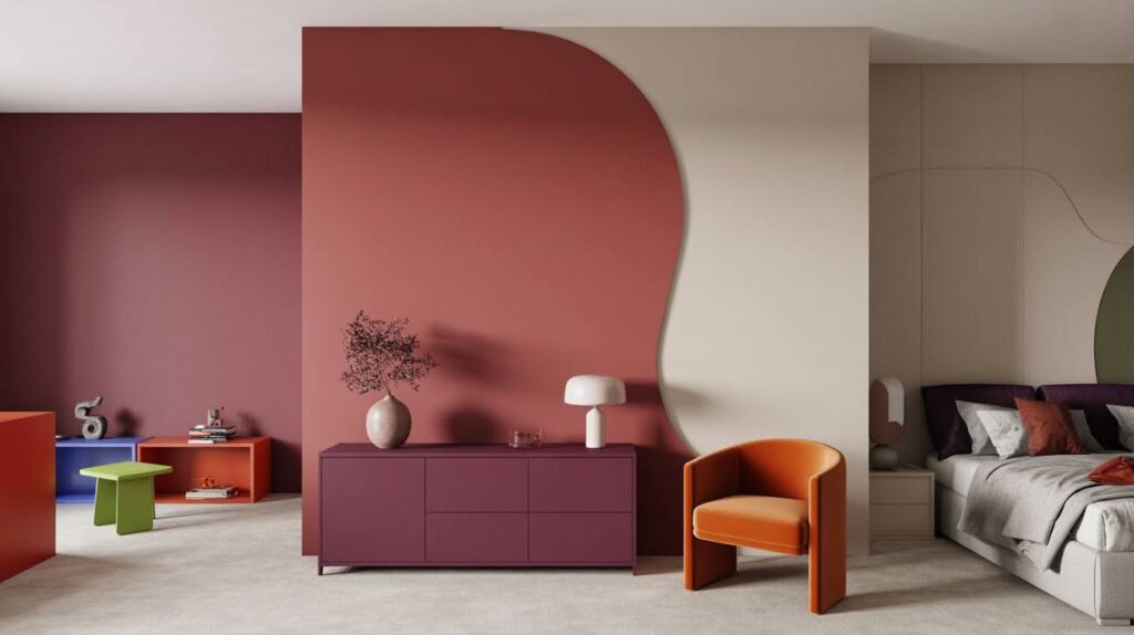
Strategic placement of saturated colors changes spaces while maintaining visual harmony and comfort.
Accent walls work perfectly for adding saturated color without overwhelming a room. Choose one wall for a bold hue and keep others neutral. This creates focus without chaos.
Statement furniture pieces let you experiment with saturated colors. A bright orange chair or deep purple cabinet adds personality. You can change these pieces more easily than wall paint.
Use high saturation in playful spaces like kids’ rooms or creative studios. Choose low saturation for calm areas like bedrooms and meditation spaces.
Fashion and Personal Style with Saturated Colors
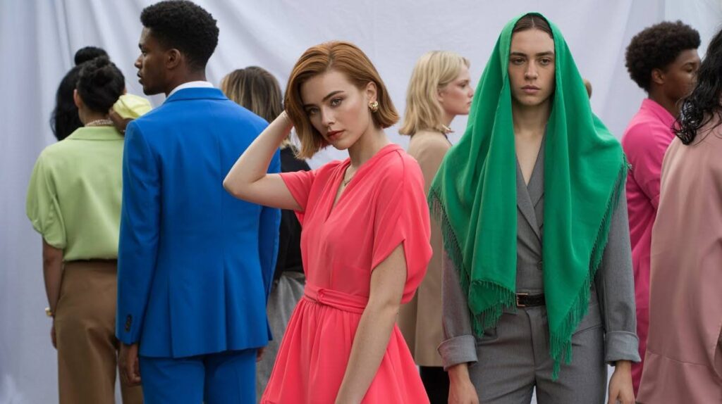
Saturated colors in clothing create memorable looks and express individual personality through bold color choices.
Bold saturated outfits make instant statements. A bright coral dress or electric blue suit commands attention. These pieces work great for special events or when you want to stand out.
Mix saturated tones with neutral basics for everyday wear. Pair a vibrant top with black pants or wear a saturated scarf with a gray outfit. This approach lets you experiment safely.
Seasonal color palettes change throughout the year. Spring brings fresh saturated pastels. Summer features bright tropical hues. Fall showcases rich saturated earth tones. Winter calls for deep jewel colors.
Saturation in Digital Design and Art
Digital platforms use saturation strategically to create brand recognition and guide user attention effectively.
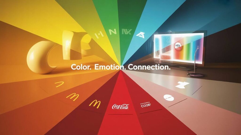
Branding relies heavily on saturated colors for recognition. McDonald’s golden arches use high saturation yellow. Coca-Cola’s red is instantly recognizable worldwide. These colors become part of brand identity.
Digital color pickers use HSV models because they’re intuitive. Designers can adjust saturation levels easily. This control helps create consistent color schemes across projects.
Graphic design case studies show saturation’s power. High saturation grabs attention in advertisements. Lower saturation creates professional looks. The choice depends on the message and audience.
Common Mistakes to Avoid with Saturated Colors
Learning from common errors helps you use saturated colors more effectively in any creative project.
- Paint chips often look different on walls than in small samples. That bright yellow chip might overwhelm an entire room. Always test larger samples in your actual lighting conditions.
- Overusing saturation in large areas creates visual chaos. A room painted entirely in saturated colors can feel uncomfortable. Use these bold hues as accents instead of main colors.
- Undertones matter more than you think. That saturated red might have orange or blue undertones. These undertones affect how the color looks with other elements in your space.
Conclusion
You know, after years of playing with colors in different spaces, I’ve realized that bold, saturated hues are a lot like adding hot sauce to your favorite dish. Pure magic.
I used to be terrified of bright colors, thinking they’d be too much.
But here’s what I’ve learned: it’s not about avoiding saturated colors, it’s about being smart with how you use them.
Start baby steps, maybe a gorgeous coral throw pillow or one dramatic accent wall. See how it makes you feel when you walk into the room. Does it energize you or stress you out?
The truth is, color is so personal. What makes me feel alive might give you a headache, and that’s totally okay! Trust what your gut tells you.
With a little experimenting, you’ll find your perfect balance.
Frequently Asked Questions
What’s the difference between saturated and bright colors?
Saturated colors have pure pigment with no gray mixed in. Bright colors combine high saturation with high value (lightness). A color can be saturated but not necessarily bright.
Can I use saturated colors in small rooms?
Yes, but use them strategically. One accent wall or colorful furniture pieces work well. Avoid painting all walls in saturated colors as this can make small spaces feel cramped.
How do I know if a color is too saturated for my space?
If the color feels overwhelming or makes you uncomfortable after spending time in the room, it might be too saturated. Test colors with large samples before committing.
Do saturated colors work in professional settings?
Saturated colors can work professionally when used as accents. Deep saturated blues or greens often work well in offices. Avoid overly bright saturated colors in conservative business environments.
How do I fix a room that feels too saturated?
Add neutral elements like white, gray, or beige accessories. Incorporate natural materials like wood or stone. Consider replacing some saturated elements with lower saturation alternatives.