
Are you struggling in order to find all of the perfect colors since they work beautifully with Sherwin Williams Agreeable Gray? You’re not alone.
Agreeable gray coordinating colors can feel quite confusing, but truly this beloved greige has become just a homeowner favorite.
After helping many clients I know the combinations that truly work when creating beautiful real homes.
This guide shares particular color pairings which yielded pleasant results for my customers. Agreeable Gray’s unique qualities will be examined, and also its reaction in relation to diverse lighting.
Furthermore, you’ll find the colors that best complement within it. Options for interior as well as exterior together with ideas for each room will be covered.
Practical tips for coordinating your entire home with confidence shall also be covered.
What is Agreeable Gray?

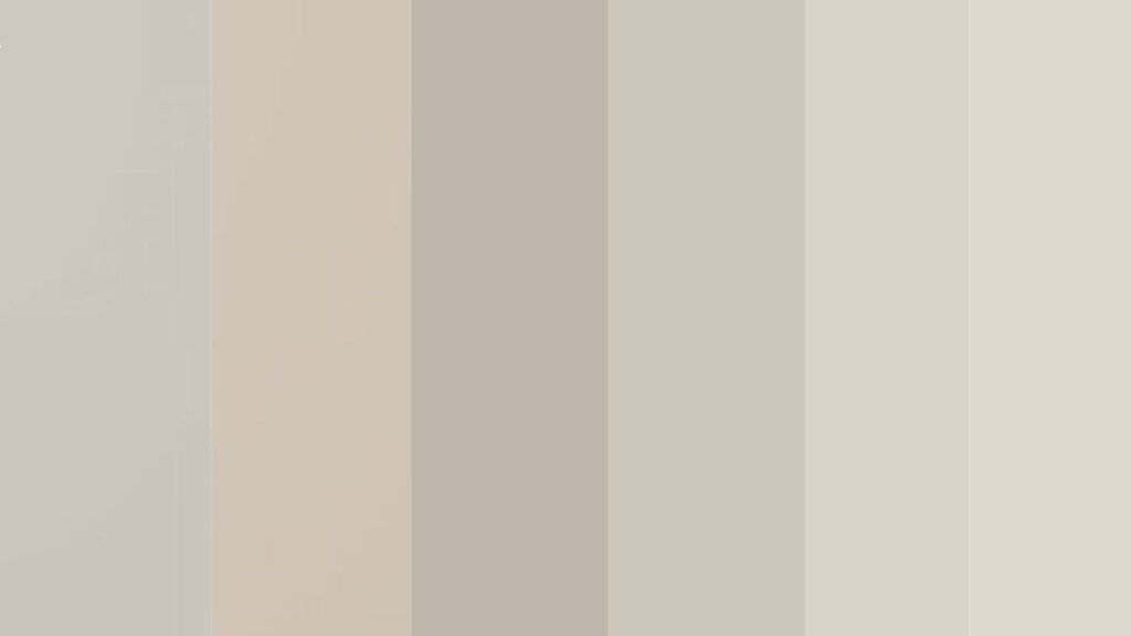
Agreeable Gray combines gray and beige to create what designers call “greige.” This balanced neutral has a Light Reflectance Value of 60, making rooms feel bright and open.
The color works well because it’s versatile, timeless, and truly neutral. It doesn’t lean too warm or too cool. This balance helps it work with many furniture styles and room types.
Sherwin Williams created this color as SW 7029 and it remains a top choice for designers. The paint reads differently in various lighting conditions. Natural light brings out warm beige tones while artificial light shows more gray.
Homeowners love it because it’s safe yet interesting. It provides a calm backdrop without being boring. The color works with both warm and cool accent colors, making decorating simple and flexible.
Agreeable Gray Undertones
Agreeable Gray has warm beige undertones with tiny hints of green. These undertones make it feel welcoming rather than cold.
In very bright sunlight, you might see rare pink undertones. This happens only in specific lighting conditions.
These undertones help you choose furniture and accessories. Warm woods, whites, and soft colors all work well together.
The beige base comes from yellow pigments mixed into the gray formula. This creates warmth without looking muddy. The subtle green hints prevent it from appearing too cream-like.
Room direction affects what undertones show most. North-facing rooms display cooler gray tones. South-facing spaces bring out warm beige. The pink undertones appear rarely in very bright, direct sunlight.
Understanding undertones helps with decorating. Warm metals like brass and gold work better than cool chrome. Wood tones from honey oak to walnut complement the beige base naturally.
Where to Use Agreeable Gray
- Living rooms benefit from its calming effect and work with any furniture style
- Bedrooms become restful retreats that promote better sleep and relaxation
- Bathrooms look spa-like and make small powder rooms feel larger
- Hallways connect spaces smoothly throughout your entire home
- Stone and brick homes look great with Agreeable Gray shutters and front doors
- Open-concept spaces flow seamlessly from kitchens to living and dining areas
- Whole-home coordination creates sophisticated, pulled-together look without feeling boring
Coordinating Colors for Agreeable Gray
These proven color pairings create rooms that feel balanced and thoughtfully designed without overwhelming your space.
1.Farmhouse Style Palette

Sea Salt (SW 6204): brings calm blue-green tones that work beautifully in kitchens and bathrooms. This soft neutral adds freshness without being too bold. It has an LRV of 63, making spaces feel bright and open.
Steamed Milk (SW 7556): offers cozy warmth for rooms that need extra comfort. It’s perfect for bedrooms and living spaces with limited natural light. This creamy neutral has subtle yellow undertones that prevent coldness.
Mega Greige (SW 7031): adds beige-brown depth when you want more drama on accent walls or in cozy reading nooks. With an LRV of 60, it matches Agreeable Gray’s brightness while adding richness.
2.Whites and Creams for Trim and Ceilings

Pure White (SW 7005): creates crisp, clean contrast against Agreeable Gray walls. It makes trim and moldings pop without feeling harsh. This true white has no undertones to clash with your main color.
Extra White (SW 7006): works slightly brighter and gives trim a fresh, updated look. Many designers choose this for modern farmhouse styles. It’s Sherwin Williams’ brightest white option.
Alabaster (SW 7008): brings soft warmth that complements the beige undertones naturally. It’s less stark than pure white options. This popular choice has subtle cream undertones that feel inviting.
Incredible White (SW 7028): feels fresh and subtle for nearby rooms that connect to Agreeable Gray spaces. It flows smoothly without sharp transitions. The slight gray undertones create perfect harmony.
West Highland White (SW 7566): adds creamy invitation to formal spaces like dining rooms and entryways that need welcoming warmth. It has gentle yellow undertones that work with traditional decor.
3.Greige and Neutral Friends
Repose Gray (SW 7015): runs cooler and slightly darker for rooms that need more sophistication. It pairs well in open floor plans. This popular choice has subtle blue undertones and an LRV of 58.
Accessible Beige (SW 7036): leans warmer and more beige for traditional homes that need cozy comfort in family spaces. It has an LRV of 58 and works well with wood trim throughout your home.
Anew Gray (SW 7030): provides soft, warm gray tones that work in bedrooms and quiet spaces throughout your home. It’s slightly lighter than Agreeable Gray with similar undertones for perfect coordination.
Revere Pewter (Benjamin Moore HC-172): offers versatile, earthy qualities that many homeowners love for its slightly muddy, rich appearance. This greige has green undertones and works in both traditional and modern spaces.
Edgecomb Gray (Benjamin Moore HC-173): appears lighter and more airy for rooms that need to feel more open and spacious. It has stronger beige undertones and an LRV of 63 for bright, welcoming spaces.
Pale Oak (Benjamin Moore OC-20): gives off-white warmth with subtle beige hints that create calm, spa-like bathrooms and bedrooms. This 2017 Color of the Year has an LRV of 69 for maximum brightness.
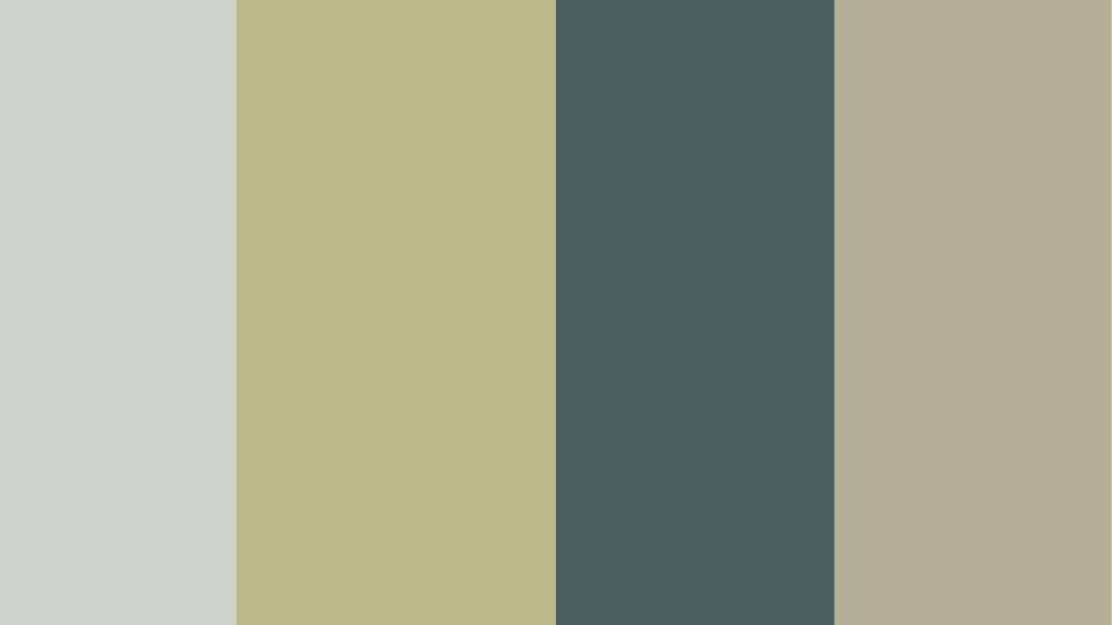
4.Blues for Contrast and Calm

Naval (SW 6244): delivers deep, rich navy drama for accent walls, kitchen islands, or front doors that need bold personality. This classic navy has an LRV of 4, creating stunning contrast against lighter walls.
Copen Blue (SW 6240): brings muted sophistication to bedrooms and bathrooms that need calm, restful energy without being boring. It has gray undertones that prevent it from looking too bright or childish.
Indigo (SW 6520): works as dark blue accents in pillows, artwork, or built-in bookcases for depth and interest. This rich blue has purple undertones that add sophistication to any space.
Billowy Breeze (SW 9055): adds light, airy blue feelings to powder rooms, laundry rooms, or children’s spaces that need cheerful energy. It has an LRV of 67 and subtle gray undertones for versatility.
Comfort Gray (SW 6205): combines blue-gray tones that work especially well with wood trim and natural materials throughout your home. This balanced neutral has an LRV of 59 and works in transitional spaces.
5.Greens for Fresh, Natural Balance
Sea Salt (SW 6204): provides soft blue-green neutrality that feels like ocean breezes in coastal or transitional home styles. It changes from blue to green depending on lighting conditions and surrounding colors.
Baby Bok Choy (SW 9037): creates vibrant green accents for kitchens, dining rooms, or home offices that need energizing color. This fresh green works well in small doses for personality without overwhelming spaces.
Stillwater (SW 6223): offers muted, subtle green tones for bedrooms and bathrooms that need nature-inspired calm without bright colors. It has gray undertones that keep it sophisticated and restful.
Sage (SW 2860): brings calming, earthy green feelings to family rooms, reading nooks, or anywhere you want peaceful, grounded energy. This timeless green works with both modern and traditional furniture styles.
6.Warm Accent Options

Coral Rose (SW 9004): adds soft pink warmth for accent walls in bedrooms or powder rooms. This gentle coral has beige undertones that complement Agreeable Gray perfectly.
Romance (SW 6323): provides deeper pink tones for spaces that need more drama and personality. It works well in dining rooms or reading areas that need cozy intimacy.
Iron Ore (SW 7069): creates bold black contrast for modern spaces that need striking accents. This soft black has brown undertones that prevent it from feeling too harsh against neutral walls.
Pros and Cons of Agreeable Gray
Every paint color has strengths and weaknesses, and Agreeable Gray is no different.
Pros
- This neutral color works anywhere in your home. It’s truly timeless and won’t look dated in five years.
- Versatile enough for any decorating style from farmhouse to modern. Works with both wood and white trim beautifully.
Cons
- Can appear dingy in rooms with poor lighting. North-facing rooms might need extra light sources.
- May seem too dark without proper lighting planning. Consider this before painting large spaces.
- Might clash with cool gray accents if you prefer a modern, crisp look throughout your home.
Conclusion
After working with Agreeable Gray coordinating colors for years, I can confidently say that it is this versatile greige that finds the perfect foundation for any home. Comprehension of how your lighting affects this adaptable shade is the secret.
Consider companions fitting for space with individual style too. Established victors feature smooth Sea Salt as well as firm Naval combinations.
Watch how this timeless color brings everything together as you start inside one room, test samples under your actual lighting conditions.
Are you prepared now to refresh your living space? Obtain some samples then watch the magic in your home.
Frequently Asked Questions
What colors go best with Agreeable Gray?
Sea Salt, Extra White, and Steamed Milk work beautifully. Naval and Iron Ore add drama while Coral Rose brings warmth.
Does Agreeable Gray look good with white trim?
Yes, white trim looks great with Agreeable Gray. Extra White and Alabaster are top choices that complement the beige undertones.
Is Agreeable Gray too dark for small rooms?
It can be in low-light spaces. Add lamps and light sources to prevent it from looking dingy or flat.
What undertones does Agreeable Gray have?
It has warm beige undertones with subtle green hints. Rarely, bright sunlight might show pink undertones.
Can I use Agreeable Gray throughout my whole house?
Absolutely. Its neutral nature makes it perfect for open floor plans and connecting different spaces smoothly.