
Thinking about reposing gray kitchen cabinets in your home? The location that is correct is just here. A calm feeling is one that is created by this warm neutral gray color without it looking dull.
I’ve helped homeowners for years. I’ve helped them in choosing cabinet colors. I know what works. This guide explains using Repose Gray (SW 7015) upon cabinets.
This color will reveal which cabinet styles work best.Also suggestions regarding wall color and lighting tips are provided.
You will learn just how to make repose gray kitchen cabinets work. This will be at the end of that explanation.
Why Choose Repose Gray for Kitchen Cabinets

Repose Gray works in almost any kitchen style. Contemporary, transitional, or farmhouse kitchens all look great with this color.
The greige undertones add subtle warmth without feeling beige. It stays balanced in different lighting throughout the day.
This shade pairs well with white quartz, black granite, or neutral marble countertops. Hardware options are plentiful too.
Matte black gives a modern look. Brushed nickel keeps things refined. Brass or gold adds warmth and character.
Cabinet Style Options with Repose Gray
From shaker to modern, this color works with every cabinet design.
Shaker-Style Cabinets
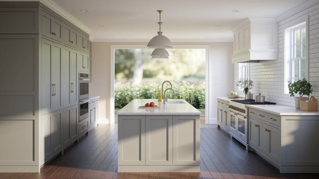
Shaker cabinets are a classic for good reason. The simple frame and center panel design lets Repose Gray shine. This combination works in modern farmhouse kitchens and traditional spaces alike.
The clean lines enhance the subtle nature of the color. Nothing fights for attention. Everything feels balanced.
Slim and Minimalist Cabinets
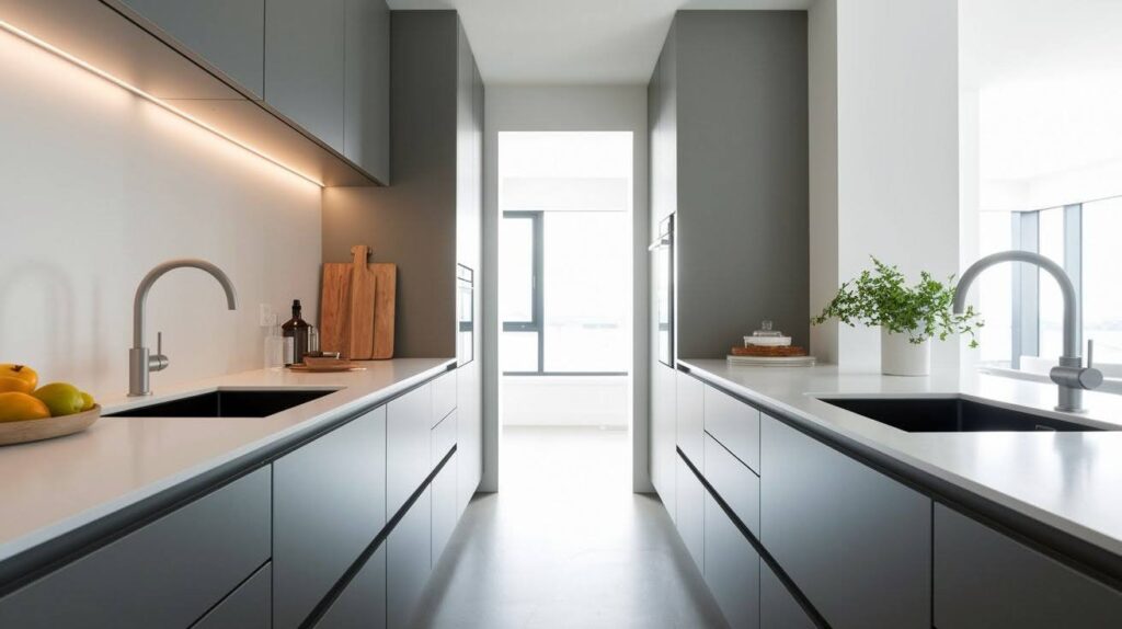
Sleek, flat-front cabinets create a contemporary feel. The smooth surfaces show off the color beautifully. This style works especially well in smaller kitchens.
Narrow layouts benefit from this streamlined look. The gray keeps things light without overwhelming the space.
Two-Tone Kitchens
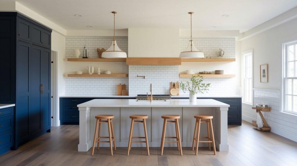
Try Repose Gray on your island with different colors around the perimeter. Navy blue creates a striking contrast. Charcoal gray adds depth. White cabinets keep things bright and airy.
This approach adds visual interest. It breaks up large expanses of cabinetry. Your kitchen gains personality and dimension.
Coordinating Colors & Accents
The right accent colors bring out the best in gray cabinets.
Light Neutrals

Alabaster (SW 7008) walls create a soft, cohesive look. Creamy (SW 7012) adds warmth without competing. Agreeable Gray (SW 7029) provides subtle variation in tone.
These lighter shades make your kitchen feel spacious. They let natural light bounce around the room.
White trim and ceiling molding complete the airy feel. Pale gray backsplash tiles add texture without breaking the flow.
Bold & Rich Accents

Iron Ore (SW 7069) works beautifully for a feature wall. Urbane Bronze (SW 7048) adds richness to a pantry door. Naval (SW 6244) creates drama on lower cabinets in a two-tone setup.
Dark accents ground the space. They add weight and depth. Charcoal grout lines on white subway tiles provide contrast. Black window frames or door hardware tie dark elements together. Deep tones make the gray cabinets feel lighter by comparison.
Natural & Wood Tones

Timber floating shelves warm up Repose Gray cabinets. Oak countertops or butcher block islands add organic texture. Light wood floors create a Scandinavian-inspired feel.
These natural elements prevent the kitchen from feeling too cool. They invite people in and make the space cozy.
Walnut cutting boards and wooden bar stools bring additional warmth. Bamboo utensil holders or woven pendant lights add earthy touches. Natural fiber rugs soften hard surfaces underfoot.
Green & Blue Accents

Soft sage green on walls pairs beautifully with gray cabinets. Olive tones in textiles or plants add life. Navy backsplash tiles create a focal point.
Indigo bar stools or chair cushions bring in personality. These colors feel fresh and unexpected. Potted herbs on windowsills add both color and function.
Teal dish towels or mint green glassware provide pops of brightness. Forest green pendant lights work well over islands. Blue and green ceramics displayed on open shelving create visual interest.
Lighting & Finishes
Light and sheen can change how your cabinets look throughout the day.
Sheen Selection: Gloss or satin finishes reflect light well. They make cabinets look brighter and more polished. These work great in kitchens with good natural light.
Eggshell or matte finishes create a softer appearance. They hide fingerprints better. The look feels more casual and lived-in.
How Lighting Affects Repose Gray: North-facing kitchens get cooler, indirect light. Repose Gray may look slightly more true gray here. South-facing kitchens get warm, direct sun. The greige undertones show up more.
In dimmer kitchens, lighter upper cabinets help bounce light around. Consider adding under-cabinet lighting. This prevents the space from feeling too dark.
Tips for Styling Your Repose Gray Kitchen Cabinets
Small changes make a big difference in how your kitchen feels.
- Pick wall colors that complement without matching exactly. A shade lighter or warmer works well. This creates depth instead of a flat, one-note look.
- Mix metals throughout the space. Brass pendant lights with nickel cabinet pulls add interest. Don’t worry about matching everything perfectly.
- Add texture through wood cutting boards, woven baskets, or linen towels. These small touches make the kitchen feel welcoming. They break up hard surfaces.
- Bring in pops of color with fresh flowers, fruit bowls, or colorful dishes. Even small accents make a difference. They add personality to neutral cabinets.
- Always test paint samples on your actual cabinets first. Paint a large section and observe it for several days. Check how it looks in morning, afternoon, and evening light. This step saves regrets later.
Conclusion
Your kitchen deserves a color that repose gray kitchen cabinets exactly does, also grows with you.
Prior to my first sample, I remember hesitating, wondering if it would work. It remains quite fresh years afterward.
This week, grab at that paint sample. Test it in evening glow and in morning light. Grasp your favorite mug. See how it feels holding it in hand. Make it happen for when you are then ready now.
What’s holding you back? Share all of your kitchen plans via commenting down below in order to start up a discussion.
Frequently Asked Questions
Does Repose Gray look too dark for small kitchens?
No, it works well in small spaces. Pair it with white countertops and good lighting for best results.
What’s the best hardware color for Repose Gray cabinets?
Matte black creates modern contrast. Brushed nickel offers a timeless look, while brass or gold adds warmth.
Can I use Repose Gray in a farmhouse kitchen?
Yes, it works beautifully. Pair it with white shiplap walls and natural wood accents for warmth.
How is Repose Gray different from Agreeable Gray?
Repose Gray is cooler and more true gray. Agreeable Gray leans warmer with stronger beige undertones.
Should I paint walls the same color as cabinets?
No, use a lighter shade on walls. This creates depth and makes gray cabinets stand out better.