
Looking for the ideal neutral paint color that promises your choice is foolproof? You’re not alone.
Homeowners clearly favor Sherwin-Williams Accessible Beige (SW 7036), and I understand the reason why I’ve seen that.
That ideal equilibrium is what this cozy hue attains. It shall not overwhelm you by way of yellow undertones, but it shall not leave rooms to be feeling cold or gray.
It is its beautiful adaptability for different lighting and function within any style from modern to customary that are what I love most.
In this guide I’ll share why this color works well in actual homes and give practical tips so you maximize this shade in your space.
Understanding Accessible Beige
Accessible Beige sits right in the sweet spot with an LRV (Light Reflectance Value) of 58, which means it reflects just the right amount of light without being too bright or too dark.
In north-facing rooms, it stays warm and cozy, while in south-facing spaces with lots of sunlight, it won’t look washed out.
The secret lies in its subtle gray and green undertones that keep it from looking too yellow or pink, making it feel balanced and natural in any space.
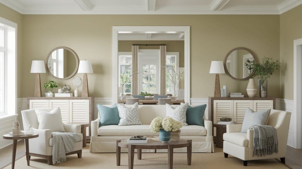
This versatile neutral works beautifully across all design styles, from modern farmhouse and traditional to transitional, coastal, and contemporary looks, adapting perfectly to your personal vision while maintaining its sophisticated, timeless appeal.
Accessible Beige Compared to Other Neutrals
Choosing between popular neutrals can feel overwhelming. Let’s break down how Accessible Beige stacks up against two other favorites.
Accessible Beige vs Repose Gray

Repose Gray leans cooler with more pronounced gray undertones. It feels crisp and clean but can sometimes appear stark in rooms without much natural light.
Accessible Beige brings more warmth to your space while still maintaining that sophisticated neutral feel.
Choose Repose Gray if you love cooler tones and have plenty of natural light. Pick Accessible Beige when you want something that feels more inviting and cozy.
Accessible Beige vs Agreeable Gray

Agreeable Gray is a true greige with balanced warm and cool undertones. It’s slightly more gray than Accessible
Beige but still maintains warmth. Both work well in most spaces, but Accessible Beige feels a touch more beige and less gray.
Go with Agreeable Gray for a more contemporary feel. Choose Accessible Beige when you want something that leans slightly warmer and more traditional.
Accessible Beige Color Palette Examples
Lets have a better understanding of this shade by going through the examples:
Color Palette 1: Warm Sophistication
This palette combines Accessible Beige with Alabaster, Pure White, Sanderling, Cadet, Dovetail, and Urbane Bronze. The result is a rich, layered look that feels both cozy and refined.
Application Ideas: Use Accessible Beige on main walls and Alabaster for trim work. Pure White works perfectly for ceilings and built-ins.
Sanderling makes a beautiful accent wall in a dining room or bedroom. Cadet and Dovetail add depth through furniture pieces or cabinetry. Urbane Bronze brings drama as front door color or window trim.
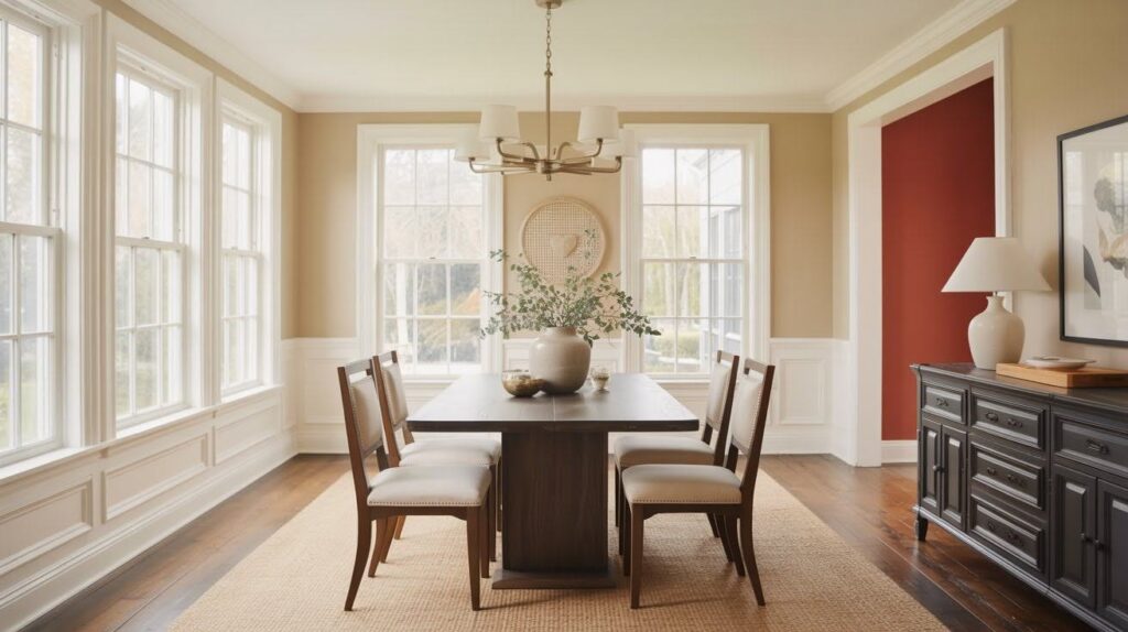
Color Palette 2: Refreshing Balance
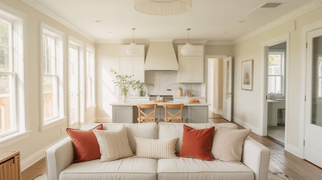
Pair Accessible Beige with Extra White, Repose Gray, Sea Salt, and Rustic Red for a fresh, balanced feel that works throughout your home.
Application Ideas: This combination shines in open floor plans where rooms flow together. Use Sea Salt in bathrooms for a spa-like feel.
Repose Gray works beautifully for kitchen island cabinetry. Rustic Red adds warmth through decorative accents like pillows or artwork.
Color Palette 3: Natural Harmony
Combine Accessible Beige with Alabaster, Mindful Gray, Pine Cone, and Softened Green for an organic, nature-inspired look.
Application Ideas: Try Pine Cone on kitchen cabinetry with Accessible Beige walls. Softened Green makes stunning accent walls or appears beautifully in textiles and plants.
Mindful Gray works well for bathroom vanities or wooden furniture stain colors.
How Accessible Beige Fits Different Design Styles
See how this versatile neutral adapts to farmhouse, traditional, contemporary, transitional, and coastal design approaches.
1. Modern Farmhouse
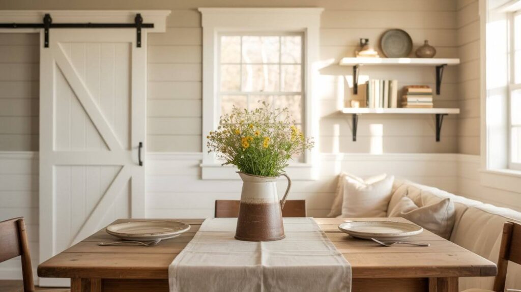
Accessible Beige creates the perfect foundation for this popular style. Pair it with crisp white trim and shiplap for that classic farmhouse look. The warm undertones complement reclaimed wood beams, barn doors, and vintage-inspired fixtures beautifully.
Add rustic wood accents through floating shelves or dining tables. The color feels right at home with galvanized metal and cozy textiles.
2. Traditional
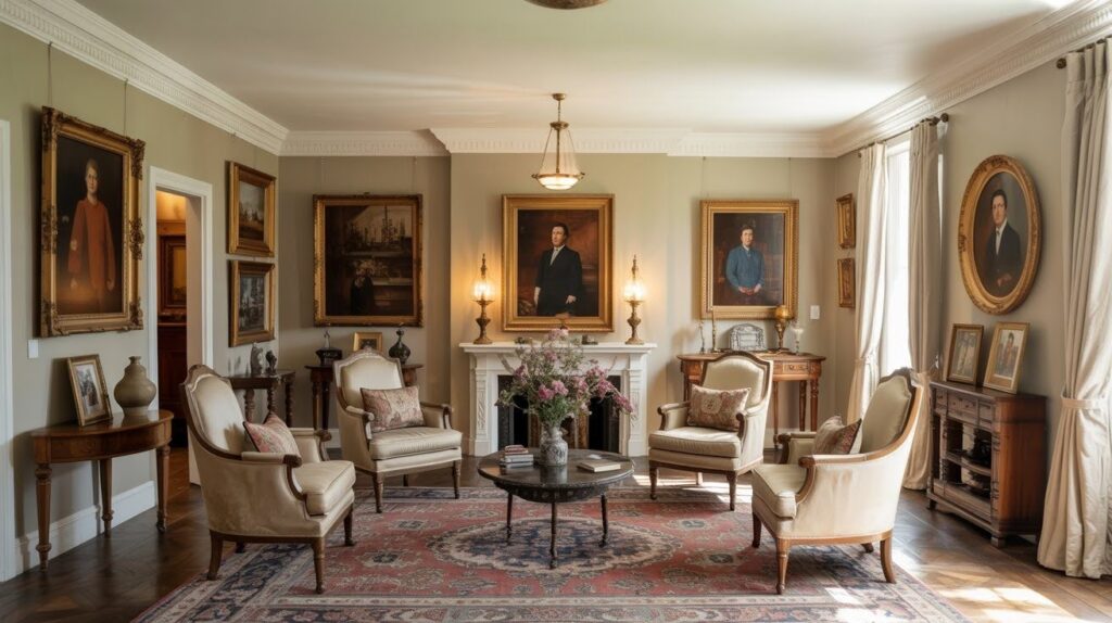
This neutral provides a backdrop that lets your classic furniture shine. Antique pieces pop against these warm walls, while oil paintings and family portraits look perfectly at home.
The color works well with rich fabrics, oriental rugs, and traditional crown molding. It feels timeless without competing with your cherished pieces.
3. Contemporary
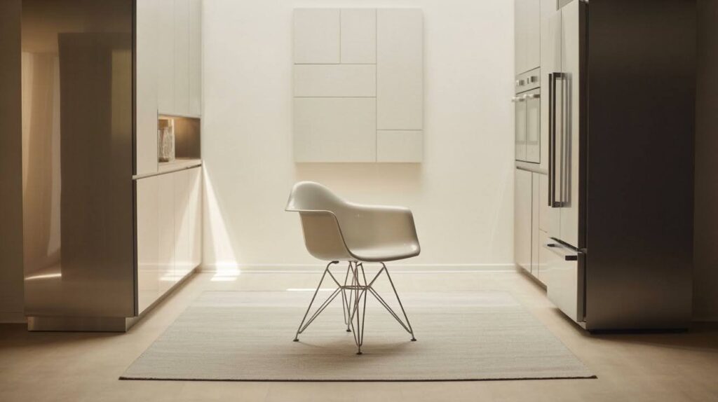
Clean lines and minimalist design get a boost of warmth with Accessible Beige. It softens stark white spaces without adding visual clutter or breaking the sleek aesthetic.
The color pairs beautifully with stainless steel appliances, geometric artwork, and modern furniture pieces.
4. Transitional
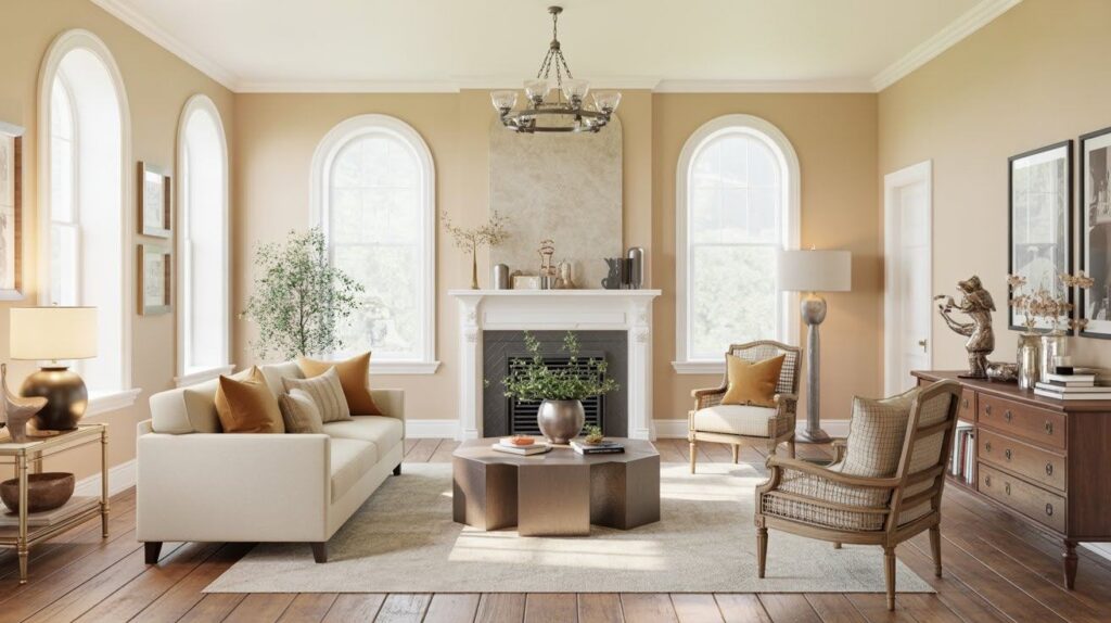
This style blends old and new seamlessly, and Accessible Beige bridges that gap perfectly. It complements both vintage finds and updated fixtures in the same space.
Use it to tie together mixed metals, varied textures, and furniture from different eras.
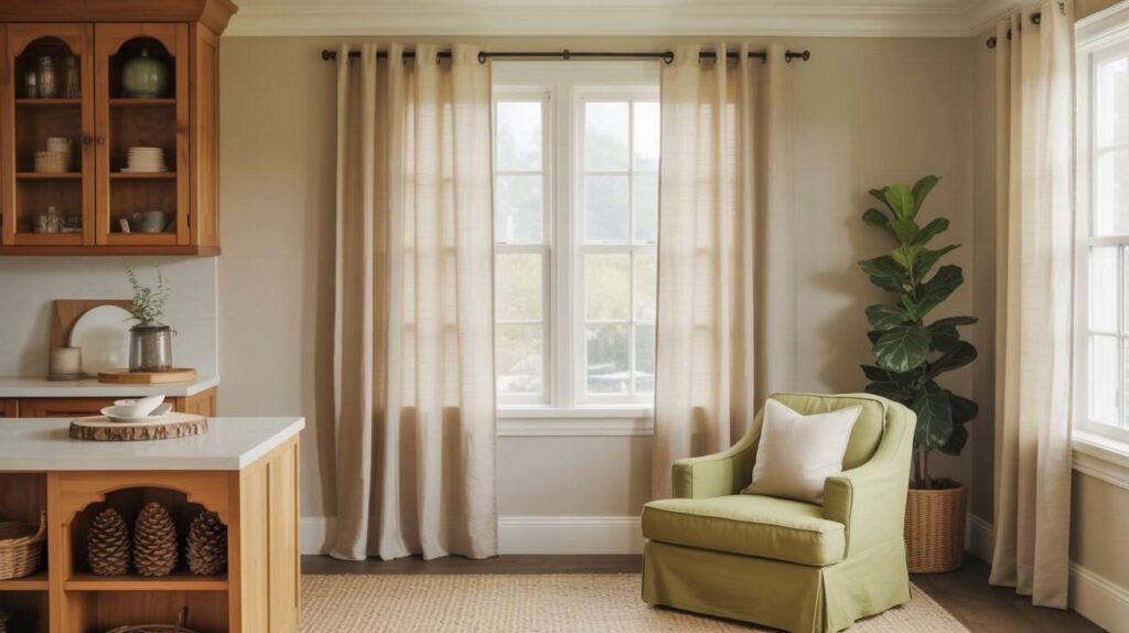
5. Coastal
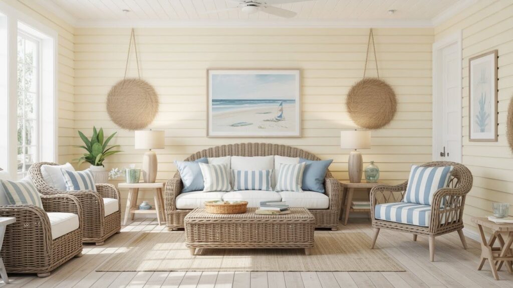
Ocean-inspired spaces love this warm neutral. It complements soft blues, seafoam greens, and crisp whites beautifully. The color feels like sun-bleached driftwood or sandy beaches.
Natural light makes beach houses and waterfront homes feel bright and airy. Add wicker furniture and nautical accessories for the complete look.
Design Tips for Using Accessible Beige
- North-facing rooms bring out warmer beige tones while south-facing spaces keep the color looking fresh. Choose warm LED bulbs to emphasize beige undertones or cool bulbs for grayer tones.
- Oak and maple hardwood create classic combinations while walnut adds rich contrast. Travertine and marble tiles complement the warm undertones beautifully.
- Neutral carpets in cream or gray work perfectly as grounding elements. Patterned carpets with multiple colors use beige as a calming backdrop.
- Brass and bronze metal finishes add warmth and traditional appeal. Matte black creates modern contrast and clean definition against these walls.
- Light woods like pine feel fresh and casual in any room. Dark woods like cherry or mahogany add sophisticated depth and richness.
- This neutral serves as the perfect canvas for bold artwork and colorful pillows. Patterned textiles and statement pieces pop against this versatile background.
Conclusion
After years of working with paint colors, Accessible Beige exemplifies Sherwin-Williams’ most reliable neutral hues.
From cozy farmhouse kitchens as well as to sleek contemporary living rooms, it never looks boring or flat, also it works with any style.
My advice? For finding your perfect match, compare test paint samples in your actual space with Agreeable Gray and Repose Gray.
Decorating becomes effortless when using Accessible Beige, given that it keeps style timeless plus provides a backdrop. This shade is truly great as it is versatile. It makes a great base under any house.
Frequently Asked Questions
What undertones does Sherwin-Williams Accessible Beige have?
Accessible Beige has subtle gray and green undertones that keep it from looking too yellow or pink. These balanced undertones make it work well in different lighting conditions and with various decor styles.
Does Accessible Beige look different in north vs south-facing rooms?
Yes, north-facing rooms bring out the warmer beige tones while south-facing rooms keep it looking fresh and clean. The color adapts well to both situations but will have slightly different appearances based on natural light.
What colors pair best with Accessible Beige?
This neutral works beautifully with whites like Alabaster and Extra White, plus deeper tones like Sea Salt and Urbane Bronze. It also complements warm woods, brass metals, and both cool and warm accent colors.
Is Accessible Beige better than Agreeable Gray for my home?
Accessible Beige leans slightly warmer and more beige, while Agreeable Gray is a true greige with more gray tones. Choose Accessible Beige if you prefer warmer neutrals and Agreeable Gray for a more contemporary feel.
What design styles work best with Accessible Beige?
This versatile color works with modern farmhouse, traditional, contemporary, transitional, and coastal styles. It provides a warm foundation that complements both rustic and refined design elements beautifully.