
Picking curtains for your living room shouldn’t feel overwhelming, but it often does. Trust me, I’ve been there. You want something that looks great, fits your budget, and works with your space.
High ceilings can make your room feel grand. But sometimes they also make it feel cold or empty. The right curtain colors can fix this problem.
I’ve helped dozens of homeowners find their perfect window treatments. In this guide, I’ll share the exact color strategies that work best for high-ceiling spaces. You’ll learn how to create a room that feels both spacious and cozy.
By the end, you’ll know exactly which colors to choose, how to balance your space, and why certain shades work better than others. Let’s make your living room feel like home.
Understanding the Impact of Color on High Ceilings
Color isn’t just about looks – it tricks your brain into seeing space differently.
How Colors Influence Perception of Height
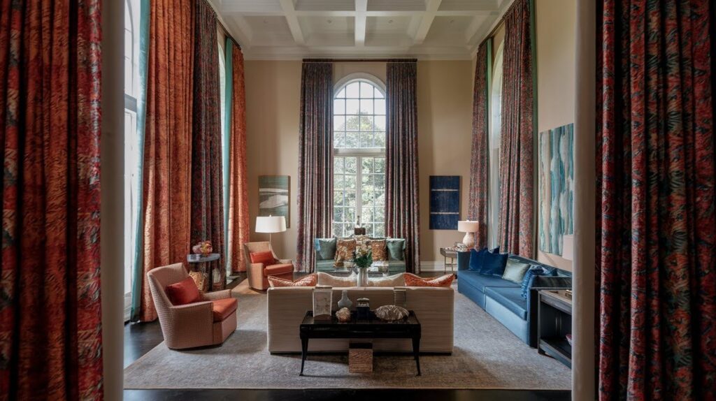
Here’s what I’ve learned from working with countless high-ceiling rooms: warm colors like reds and oranges seem to move toward you, while cool blues and greens appear to step back. This means warm curtain colors can make your towering walls feel closer and more intimate.
Light colors make spaces feel bigger and airier. Dark colors do the opposite – they compress the space and bring everything inward. In a room with soaring ceilings, dark curtains can help bring that sky-high feeling down to earth.
Why High Ceilings Need Strategic Color Choices
The trick is making your room feel cozy without turning it into a cave. I always tell my clients to think about creating layers of visual interest that draw the eye both up and across the room.
Your curtain color becomes a bridge between your floor and ceiling. Pick the right shade, and you’ll get that perfect balance between grand and welcoming. Get it wrong, and your beautiful high ceilings might work against you instead of for you.
Best Color Approaches for High-Ceiling Living Rooms
Let me share the five color strategies that work best when you need to tame those towering walls.
Warm Neutrals for a Cozy Feel
Think beige, taupe, and warm greige – these are my go-to colors for making high ceilings feel friendlier. They pull those walls down visually and wrap your room in warmth. I love pairing them with white trim and rich wood furniture. The contrast creates layers without being too bold.
Mid- to Dark-Toned Colors for Dramatic Impact
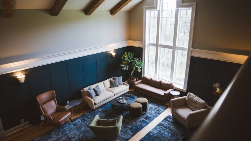
Charcoal, deep blue, and forest green might seem risky, but they’re perfect for tall spaces. Dark colors create depth and make your room feel grounded instead of floating. I sometimes even paint the ceiling the same dark shade – it sounds scary, but it works beautifully.
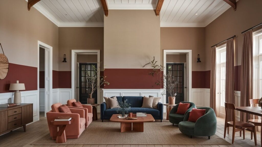
Two-Tone Wall Treatments
This is my secret weapon. Paint the bottom 8 to 10 feet darker and keep the upper walls lighter. It creates a natural stopping point for your eye and makes the room feel more human-sized. Add some molding or wainscoting at the division line for extra polish.
Earthy Natural Tones
Clay, terracotta, and muted olive bring the outdoors in and soften those imposing proportions. These colors work magic when you add wood beams, plenty of plants, and textured fabrics. Your high-ceiling room starts feeling like a cozy retreat.
Soft Whites Off-Whites with Warm Undertones
Cream, ivory, and linen white give you brightness without that cold, sterile hospital feel. These work best when you want to keep things airy but still inviting. Perfect for rooms with lots of natural light.
Using Ceiling Colors to Influence Perception
Your ceiling is the most overlooked tool for fixing that “too tall” feeling in high-ceiling rooms.
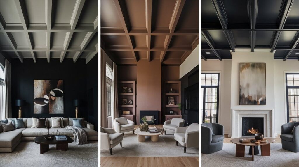
Painting the Ceiling a Darker Shade
This trick works like magic. When you paint your ceiling darker than your walls, it visually drops down and makes your room feel more intimate. I recommend soft grays, warm browns, or even deep navy for the coziest results. Your guests will notice something feels different, but they won’t know exactly what you did.
Continuing Wall Color onto the Ceiling
Instead of stopping at the wall, carry your paint color right up and across the ceiling. This creates one smooth, wraparound feeling that makes your room feel like a cozy cocoon. It also gets rid of that harsh white line that screams “look how high these ceilings are!” I use this technique all the time in bedrooms and living rooms.
Adding Color to Beams or Trim
Got exposed beams? Paint them dark for instant grounding. I love using charcoal or deep brown – it gives you that rustic feel while pulling everything together visually. If you don’t have beams, consider adding some painted trim work. Even simple crown molding in a contrasting color helps break up all that vertical space.
Accent Colors Decor to Support the Paint Choice
Your paint color is just the foundation – smart accent choices are what really bring high-ceiling rooms to life.
Incorporating Horizontal Color Elements
I always tell my clients to think horizontally in tall rooms. Hang artwork in groups at eye level, not way up high where it gets lost. Add floating shelves with colorful books and decor pieces. Choose furniture in colors that play nicely with your walls – maybe a rust-colored sofa if you’ve gone with warm neutrals.
Don’t forget about your floors. A large area rug in complementary colors pulls the lower half of your room together and gives your eye a place to rest. I like rugs that pick up two or three colors from your overall palette.
Layering Textures in Similar Tones
Here’s what most people miss: texture creates coziness just as much as color does. I love mixing woven throws with your paint colors, adding patterned cushions in the same family of tones, and choosing matte paint finishes over glossy ones.
Think about a chunky knit blanket in cream if your walls are warm beige. Or linen curtains in soft gray-blue if you’ve painted with cool tones. These texture layers make your room feel touchable and lived-in, not like a showroom.
Sample Color Palettes for High-Ceiling Living Rooms
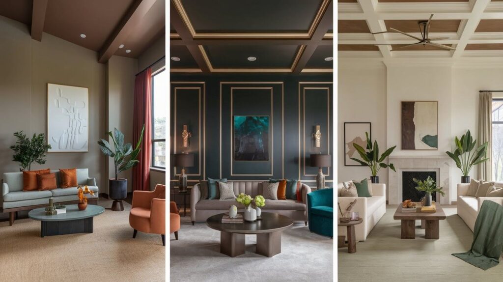
Here are three tried-and-true color combinations I use when clients need to make their tall spaces feel just right.
Cozy Warm
This palette wraps your room in comfort without making it feel heavy. I start with Benjamin Moore Edgecomb Gray on the walls – it’s that perfect greige that works with everything. For the ceiling, I go one shade lighter with a soft taupe.
The magic happens with the accents. Burnt orange throw pillows and olive green plants bring life to the space. Add some warm wood furniture and you’ve got a room that feels like a hug.
Modern Dramatic
When clients want something bold, I reach for Sherwin Williams Urbane Bronze. This rich, dark color makes high ceilings feel grounded and sophisticated. I often paint the ceiling the same color or just one shade lighter, it sounds intense but looks incredible.
Gold accents through lighting and picture frames add warmth. Deep teal in artwork or a statement chair keeps things interesting. Your room feels like an upscale hotel but way more personal.
Airy Inviting
For people who love light but want warmth, I start with Sherwin Williams Alabaster on the walls. It’s white with just enough cream to avoid that stark feeling. The ceiling gets a soft warm beige to bring everything down to earth.
Natural wood furniture and sage green accents complete the look. Think live-edge coffee tables and eucalyptus branches. Your high-ceiling room feels bright and open but never cold.
Quick Tips for High-Ceiling Color Success
- Use warm colors like beige and taupe to make tall walls feel closer and cozier
- Paint your ceiling darker than your walls to visually lower the height
- Try two-tone walls with darker color on bottom, lighter on top at 8-10 feet
- Continue your wall color onto the ceiling for a wraparound, cozy effect
- Add horizontal elements like grouped artwork and floating shelves at eye level
- Choose large area rugs in complementary colors to ground the lower space
- Layer textures in similar tones through throws, cushions, and matte finishes
- Consider dark beams or trim work to break up vertical space
- Use earthy tones like clay and olive to bring natural warmth indoors
- Pick off-whites with warm undertones instead of stark white for brightness
- Group furniture and decor horizontally rather than spreading vertically
- Add plants and natural wood to soften the scale of tall rooms
Conclusion
Choosing colors for your high-ceiling living room doesn’t have to overwhelm you. These strategies create spaces that feel grand yet inviting.
Remember lighting matters. North-facing rooms need warmer colors. South-facing spaces handle cooler tones better. Always test paint swatches in different lighting conditions first.
Color is just one piece. Pair your palette with furniture that fits your room’s scale. Tiny pieces get lost under 12-foot ceilings.
Take your time. Test your choices. Trust the process.
Your high-ceiling living room can become the cozy, stylish space you’ve always wanted.
Frequently Asked Questions
What’s the biggest mistake people make with high-ceiling room colors?
Most people stick with all-white walls thinking it will make the space feel bigger. Instead, this creates a cold, sterile feeling that emphasizes how tall the ceilings really are.
Should I paint my ceiling the same color as my walls?
Yes, this can work beautifully in high-ceiling rooms. It creates a cozy, wraparound effect that makes the space feel more intimate without losing the sense of openness.
How do I know if warm or cool colors work better in my room?
Check your natural light throughout the day. Rooms with lots of southern light can handle cool colors, while north-facing spaces need warm tones to avoid feeling chilly.
Can I use dark colors in a room with high ceilings?
Absolutely! Dark colors work great in tall spaces because they create depth and make the room feel more grounded instead of floating.
How high should I hang artwork in a high-ceiling living room?
Keep artwork at eye level, about 57-60 inches from the floor to the center of the piece. Don’t hang it higher just because you have tall ceilings.