
High ceilings look amazing, but they can make your living room feel like a museum instead of a cozy home. I get it. You want that grand feeling without the cold, empty vibe.
Color choice is your secret weapon here. The right colors can bring those soaring walls down to earth while keeping the wow factor. Wrong colors? Your room feels like an airplane hangar.
I’ve helped hundreds of homeowners solve this exact problem. In this guide, I’ll show you which colors work best for high-ceiling spaces. You’ll learn how to create warmth without losing that sense of drama.
We’ll cover:
- Warm vs cool color strategies
- Paint techniques that lower visual ceiling height
- Accent colors that add coziness
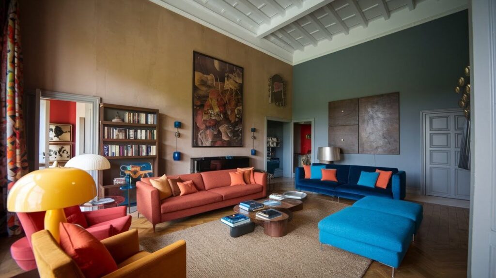
- Real examples that work
Ready to make your living room feel like home again?
Understanding the Impact of Color on High Ceilings
The colors you choose can make your tall room feel cozy or cold, here’s how to get it right.
How Colors Influence Perception of Height
Colors play tricks on your eyes, and I use this to my advantage all the time.
Warm vs. Cool Tones Warm colors like reds, oranges, and yellows seem to move toward you. Cool colors like blues and grays appear to step back. This means warm tones can make those sky-high ceilings feel closer and more intimate.
Light vs. Dark Colors Light colors reflect more light and make spaces feel bigger. Dark colors absorb light and create a cozy, wrapped-up feeling. In a high-ceiling room, darker walls can help bring the scale down to human size.
Why High Ceilings Need Strategic Color Choices
Smart color moves help you keep the grandeur while adding warmth.
You don’t want to lose that impressive vertical space completely. But you also don’t want your family room to feel like a cathedral every Tuesday night.
The trick is creating visual anchors. I use color to draw the eye horizontally across the room, not just straight up to the ceiling. This breaks up all that vertical drama and creates natural stopping points for your gaze.
Think of it like this: your walls need to have a conversation with each other, not just shout up at the ceiling.
Best Color Approaches for High-Ceiling Living Rooms
Here are my go-to color strategies that actually work in real homes with soaring ceilings.
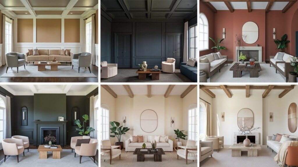
Warm Neutrals for a Cozy Feel
These colors hug you without overwhelming the space.
I love warm neutrals like beige, taupe, and warm greige for high ceilings. They create that “come sit with me” vibe instead of “look but don’t touch.”
These colors work because they have yellow or brown undertones that feel inviting. They visually pull those tall walls closer to you. I pair them with crisp white trim to keep things fresh, and they look great with both light and dark furniture.
Mid- to Dark-Toned Colors for Dramatic Impact
Bold colors ground tall spaces and create instant coziness.
Don’t be scared of charcoal, deep blue, or forest green on your walls. I use these all the time in high-ceiling rooms because they create visual weight. Your eye stops moving upward and starts enjoying the richness around you.
Try painting your ceiling the same dark color as your walls. It sounds crazy, but it works. The whole room feels wrapped and intentional instead of endless.
Two-Tone Wall Treatments
Split your walls horizontally to bring the eye level down.
This is my favorite trick. Paint the bottom 8 to 10 feet of your walls in a darker shade, then go lighter above. It instantly creates a human-scale feeling.
Add some molding or wainscoting at the division line if you want to get fancy. Even simple shiplap works great. Your eye naturally rests at that horizontal break instead of shooting straight up.
Earthy & Natural Tones
Clay, terracotta, and muted olive bring the outdoors in and soften big spaces.
These colors feel grounded because they remind us of nature. Clay and terracotta add warmth without being too bold. Muted olive brings in that calming, organic vibe.
I pair these with natural wood beams, plenty of plants, and textured fabrics. The whole room feels like a retreat instead of a showroom.
Soft Whites & Off-Whites with Warm Undertones
When you want light and bright but not cold and sterile.
Pure white can feel harsh in a big space, but cream, ivory, and linen white are different. They have just enough warmth to keep things inviting.
These work best when you have great natural light and want an airy feeling. Add warm wood tones and soft textures to keep it from feeling too clinical.
Using Ceiling Colors to Influence Perception
Your ceiling is your secret weapon for making tall rooms feel more intimate and grounded.
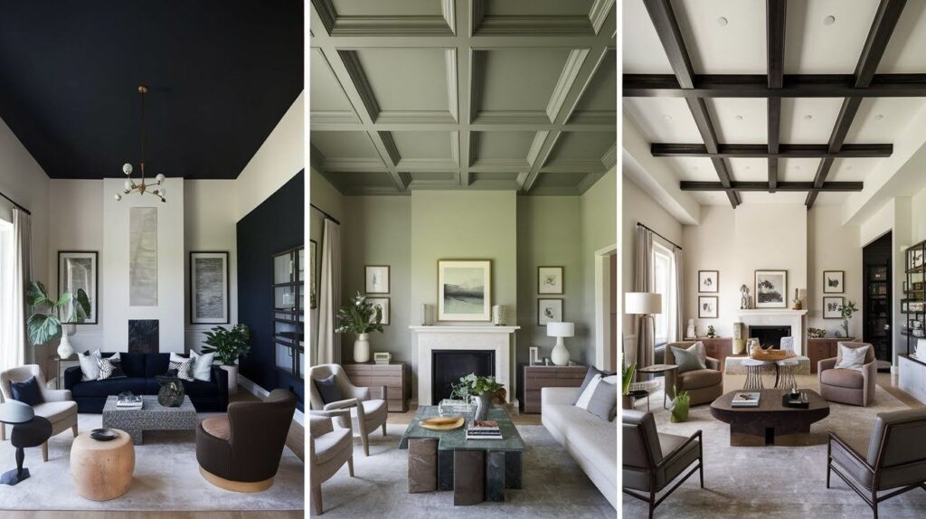
Painting the Ceiling a Darker Shade
A darker ceiling creates a visual lid that brings the whole room down to size.
This might sound backwards, but trust me on this one. When you paint your ceiling darker than your walls, it feels like it’s sitting lower. Your brain perceives the space as cozier and more contained.
I recommend rich colors like deep navy, charcoal, or even a moody green. These work especially well if you have good lighting. The darker ceiling creates a cocoon effect that makes your furniture groupings feel more intimate.
Continuing Wall Color onto the Ceiling
When walls and ceiling match, your eye stops looking for the division between them.
This creates what I call the “wrap around” effect. Instead of your walls stopping and your ceiling starting, everything flows together. The room feels complete and contained rather than open-ended.
I use this technique a lot with warm colors like sage green or soft terracotta. The whole space feels like one cozy unit instead of walls plus this big empty ceiling above.
Adding Color to Beams or Trim
Painted beams create horizontal lines that ground tall spaces naturally.
If you have exposed beams, paint them a rich color like deep brown or black. They’ll act like visual anchors that pull your eye across the room instead of straight up.
Don’t have beams? Add some faux ones and paint them to match your walls or furniture. Even painted trim around the ceiling edge helps break up all that vertical space and gives your eye somewhere to rest.
Accent Colors & Decor to Support the Paint Choice
The right accents turn your color scheme from pretty walls into a complete, cozy room.
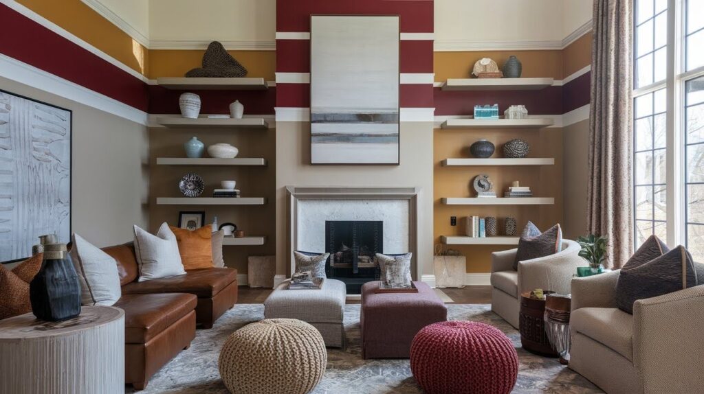
Incorporating Horizontal Color Elements
Strategic placement of color draws the eye across the room instead of up to the rafters.
I place artwork, floating shelves, and furniture at eye level to create horizontal bands of color. This breaks up all that vertical wall space and gives your room natural stopping points.
Your area rug is huge for this. I choose rugs that echo the wall colors but add pattern or texture. They anchor your seating area and make the bottom half of the room feel complete and grounded.
Think about your coffee table, side tables, and sofa too. When these pieces complement your wall colors, they create a visual flow that keeps everything connected at human scale.
Layering Textures in Similar Tones
Texture adds depth and warmth that flat color alone can’t achieve.
Here’s what most people miss: texture is just as important as the actual color. I layer in woven throws, patterned cushions, and matte finish accessories all in similar tones to your walls.
A chunky knit throw in cream over a beige sofa against taupe walls creates this rich, layered feeling. Your eye sees depth and interest instead of just flat color. The room feels lived-in and inviting instead of like a paint sample.
I mix different finishes too. Matte ceramics, rough linen, smooth leather, and nubby wool all in the same color family create visual richness that makes big spaces feel more intimate.
Quick Tips for High-Ceiling Living Room Colors
Color Selection
- Choose warm neutrals like beige and taupe to bring walls closer
- Try dark colors like charcoal or deep blue for instant coziness
- Use earthy tones like clay and terracotta for natural warmth
- Pick off-whites with warm undertones instead of stark white
Wall Techniques
- Paint bottom 8-10 feet darker, top section lighter
- Add horizontal molding or wainscoting at the division line
- Continue your wall color onto the ceiling for a wrapped feeling
- Paint ceiling darker than walls to visually lower the height
Smart Accents
- Place artwork and shelves at eye level, not high up
- Choose rugs that echo your wall colors
- Layer different textures in similar tones
- Paint exposed beams dark to create horizontal anchors
What to Avoid
- Pure white walls in large spaces
- All light colors that emphasize height
- Placing decor only at ceiling level
- Ignoring the ceiling as part of your color plan
Pro Move
- Mix matte finishes, woven fabrics, and textured accessories in your chosen color family for depth and richness
Conclusion
Getting the color right in your high-ceiling living room isn’t just about picking a pretty shade. It’s about creating a space that feels both grand and cozy.
Remember to check how your chosen colors look in different lighting throughout the day. That beautiful sage green might look completely different at noon versus 6 PM. Always test paint swatches on your actual walls first.
Your furniture scale matters just as much as your wall color. Pair your new paint with appropriately sized pieces and thoughtful decor placement. A tiny sofa against perfectly colored walls still won’t feel right.
Take your time with this process. The right color combination will make your tall room feel like the comfortable, inviting space you’ve always wanted. Your family and guests will notice the difference immediately.
Frequently Asked Questions
Should I paint my high ceiling the same color as my walls?
Yes, this creates a cohesive, wrapped feeling that makes the room feel more intimate. It eliminates the stark contrast between walls and ceiling that can make spaces feel cold and disconnected.
What’s the biggest mistake people make with high-ceiling room colors?
Using all light colors thinking it will make the space feel bigger. Light colors actually emphasize the height and can make your room feel like an empty warehouse instead of a cozy living space.
How dark can I go with wall colors in a room with tall ceilings?
You can go quite dark, even with deep charcoal or navy. High ceilings actually handle dark colors better than standard rooms because you have more natural light and space to balance the richness.
Do I need to change my furniture when I repaint my high-ceiling room?
Not necessarily, but scale matters. If your current furniture looks tiny against the walls, consider adding larger pieces or grouping smaller items together to create visual weight.
How do I test paint colors properly in a high-ceiling room?
Paint large swatches (at least 2×2 feet) on different walls and observe them at various times of day. The height and lighting in these rooms can dramatically change how colors appear throughout the day.