
I’ve noticed something interesting happening in homes lately. Dark, rich colors are taking center stage. Gone are the days when bright whites ruled every room.
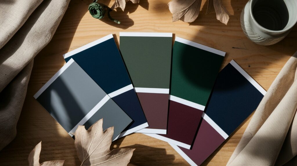
A moody color palette uses deep, saturated hues to create atmosphere. Think midnight blues, forest greens, and charcoal grays. These colors bring drama and sophistication to any space.
Interior designers love this trend because it works everywhere. Modern apartments. Traditional homes. Even minimalist spaces benefit from the right dark tones.
The magic happens when you pair these colors correctly. You get rooms that feel cozy yet refined. Intimate yet spacious. The key is knowing which combinations work best and how to balance them properly.
You don’t need to be a professional designer to pull this off. Small changes can make a big impact.
Here are some powerful ideas to bring this look home.
What Is a Moody Color Palette?
A moody color palette centers on deep, rich hues that create emotional depth in your space. These aren’t your typical bright wall colors.
We’re talking about charcoal gray, navy blue, burgundy, and forest green. Colors that feel substantial and grounding. They have weight and presence in a room.
These palettes work best when paired with soft lighting and layered textures. The combination creates visual interest without overwhelming the space.
The goal is intimacy and refinement. These colors make rooms feel like sophisticated retreats. Places where you want to spend time and relax.
Unlike bold, bright colors that demand attention, moody tones invite you in. They create a sense of calm focus that’s hard to achieve with lighter palettes.
Why Choose a Moody Color Palette for Your Home?
The atmosphere these colors create is unmatched. They instantly make any room feel more luxurious and intentional.
Moody palettes are incredibly versatile. They work in modern lofts, bohemian spaces, vintage homes, and even minimalist designs. The key is how you style them.
These colors have staying power. While trends come and go, deep, sophisticated tones remain timeless. You won’t need to repaint in two years.
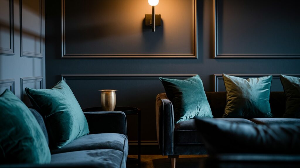
They’re perfect for layering materials. Velvet sofas look incredible against charcoal walls. Natural wood pops against deep greens. Metal accents shine in moody spaces.
The cozy factor is real. These colors naturally create the feeling of being wrapped in comfort. Your home becomes a sanctuary from the outside world.
9 Moody Color Palette Ideas to Try
These color combinations work in any room of your home. Each pairing creates a different mood and style. Pick the one that matches your space and personality.
1. Charcoal & Dusty Rose for a Romantic Bedroom

This combination balances strength with softness perfectly. Charcoal walls provide the drama while dusty rose adds warmth.
The contrast creates visual interest without being jarring. Your bedroom becomes both restful and romantic.
Gold or brass accents work beautifully here. Think picture frames, lamp bases, or drawer pulls. The warm metals bridge the gap between the cool and warm tones.
Layer in cream or white bedding to keep things from feeling too heavy. Add texture with a chunky knit throw or velvet pillows.
2. Navy Blue & Burnt Orange in the Living Room
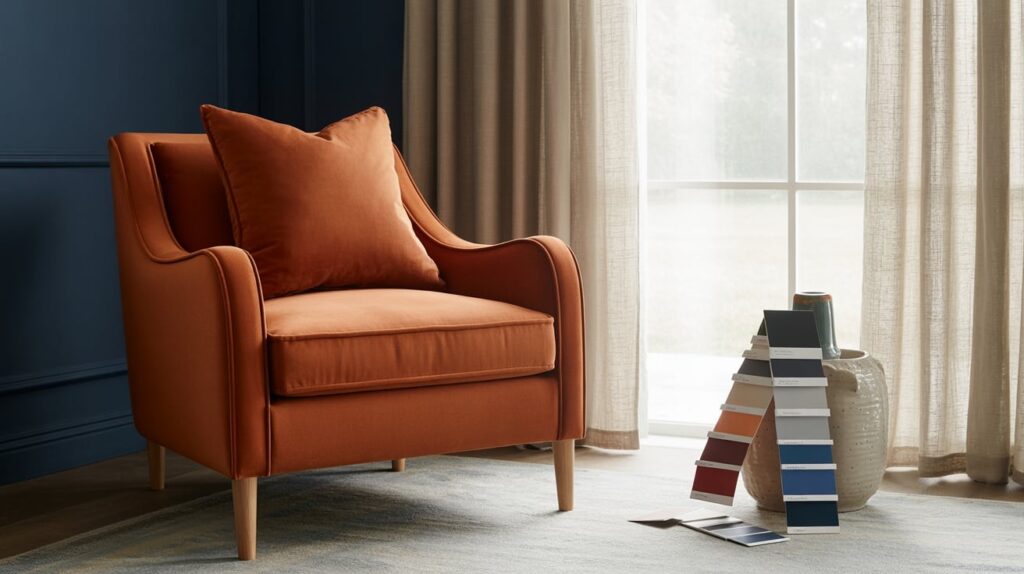
This pairing feels both cozy and contemporary. Navy provides sophistication while burnt orange brings energy and warmth.
Velvet textures amplify this combination beautifully. A navy velvet sofa with burnt orange throw pillows creates an inviting focal point.
Warm lighting is crucial here. Cool fluorescent lights will kill the mood. Use table lamps, floor lamps, and candles to create ambiance.
Natural materials like wood and rattan complement these colors perfectly. They add organic texture that keeps the space from feeling too polished.
3. Forest Green & Black for a Moody Kitchen
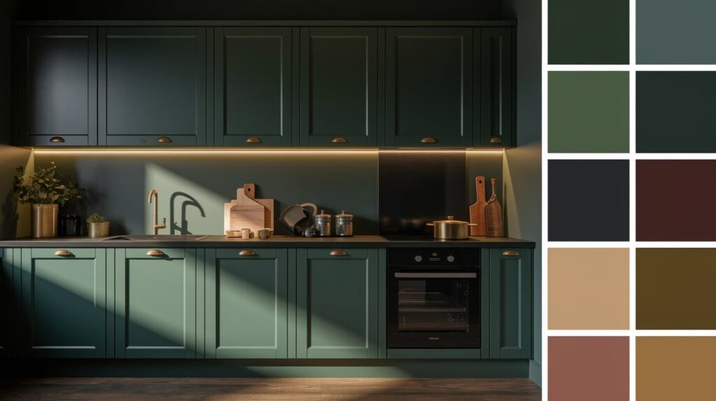
This unexpected combination creates serious drama in the kitchen. It’s bold without being overwhelming.
Forest green cabinets paired with black countertops look incredibly sophisticated. The combination feels both natural and modern.
Matte black hardware ties everything together. Think cabinet pulls, faucets, and light fixtures in the same finish.
Add warmth with natural wood elements. A butcher block island or wooden shelving prevents the space from feeling cold.
4. Deep Plum & Beige for a Chic Home Office
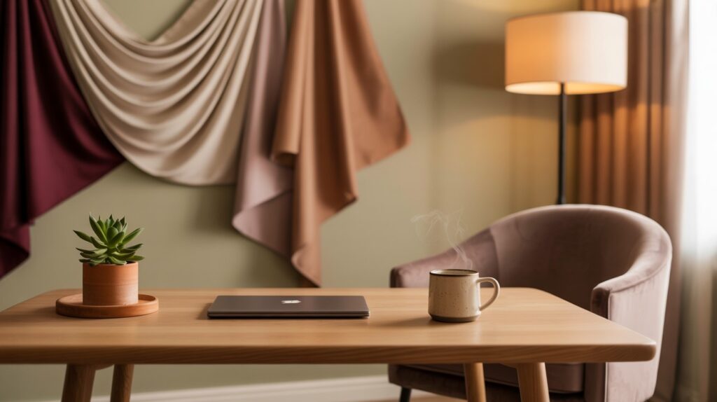
Plum energizes while beige grounds the space. This combination promotes creativity without being distracting.
The contrast helps define different areas in your office. Use plum for an accent wall and beige for the remaining walls.
Natural light works well with this pairing. If your office lacks windows, invest in good task lighting.
Brass desk accessories complement these colors beautifully. Letter holders, picture frames, and desk lamps in warm metals add refinement.
5. Olive Green & Terracotta in the Dining Area
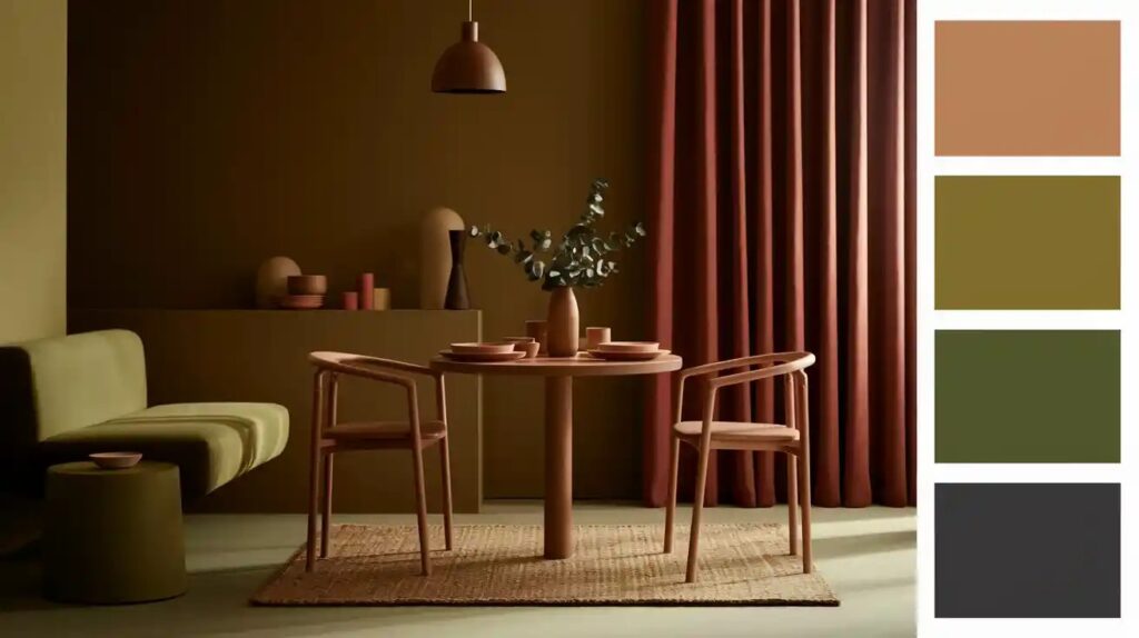
This earthy combination feels grounded and welcoming. Perfect for spaces where people gather to eat and connect.
The colors work beautifully in both modern and traditional dining rooms. They feel fresh yet timeless.
Natural wood dining tables look incredible with this backdrop. The organic textures complement the earthy color palette.
Linen curtains or chair cushions add softness. The natural fiber works with the organic feel of these colors.
6. Dark Teal & Brass for a Luxe Bathroom
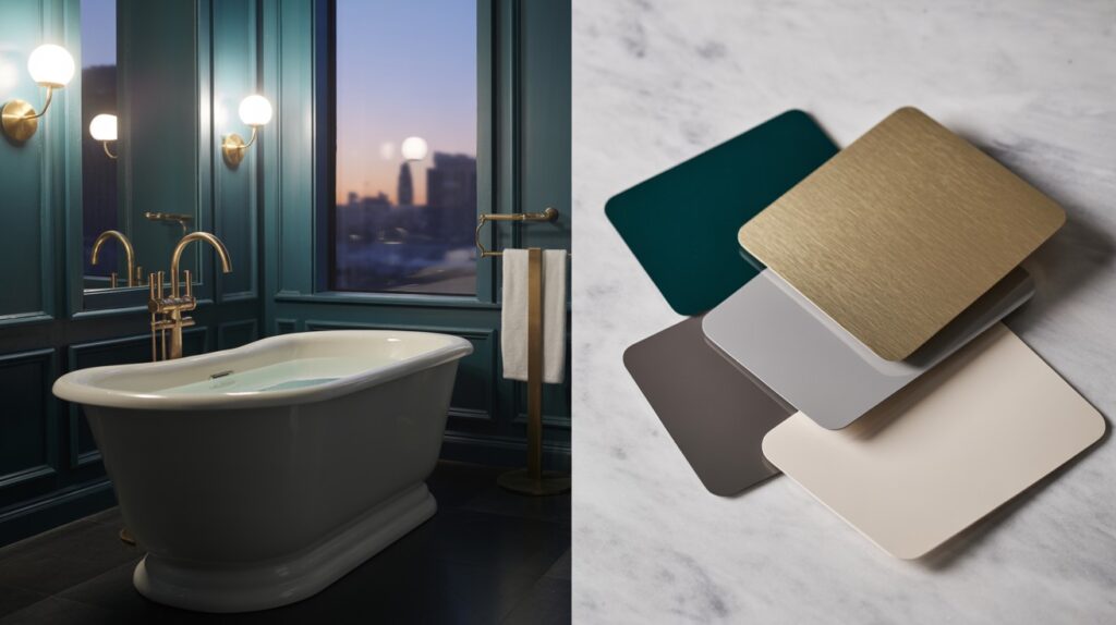
This combination creates a spa-like atmosphere that feels both dramatic and calming.
Dark teal works beautifully with white fixtures. The contrast keeps the space from feeling too dark while maintaining sophistication.
Brass fixtures complete the look. Faucets, towel bars, and light fixtures in warm brass create cohesion.
Marble or matte tiles complement this color scheme perfectly. The natural stone adds luxury while the matte finish feels contemporary.
7. Burgundy & Cream in the Entryway
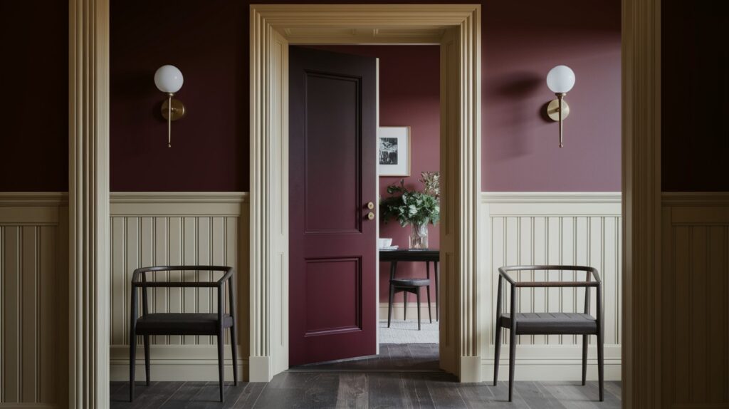
Your entryway sets the tone for your entire home. This combination creates a rich first impression.
Burgundy accent walls paired with cream trim feel both traditional and fresh. The contrast highlights architectural details.
This pairing works in both modern and traditional homes. The key is in your styling and accessories.
Consider burgundy wallpaper if paint feels too permanent. Many beautiful options exist that add texture and pattern.
8. Black & Warm Neutrals in the Hallway
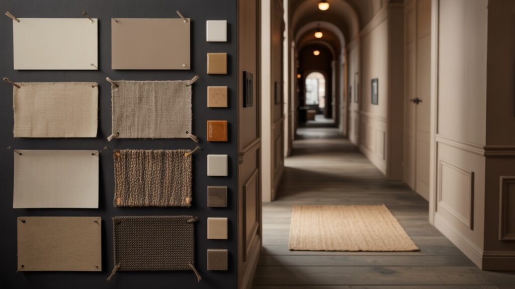
Hallways often get overlooked, but this combination makes them destinations rather than pass-through spaces.
Black accent walls provide drama while warm neutrals keep the space from feeling cramped.
This palette is perfect for showcasing art and mirrors. The dark background makes colors pop and metals shine.
Good lighting is essential in dark hallways. Wall sconces or pendant lights create both function and style.
9. Monochrome Moody Grays for a Sophisticated Vibe
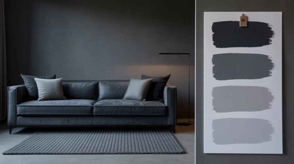
Layer different shades of gray to create depth without using multiple colors. This approach feels calm and sophisticated.
Start with slate gray on walls and work toward soft gray in textiles and accessories. The variation creates visual interest.
Texture becomes crucial in monochrome schemes. Vary materials through rugs, fabrics, and wallpaper to prevent monotony.
This palette works beautifully in bedrooms and living rooms where you want a restful atmosphere.
Tips for Styling a Moody Palette the Right Way
- Keep larger furniture pieces lighter when the walls are dark
- Use multiple light sources instead of one overhead fixture
- Mix different textures like velvet, wood, and metal
- Add mirrors to reflect light around the room
- Include plants or natural elements for warmth
- Test paint colors in different lighting before deciding
- Start with one accent wall if you’re nervous about going full dark
- Choose warm-toned light bulbs over cool ones
- Use glossy finishes on some surfaces to bounce light
- Keep window treatments light to let in natural light
Common Mistakes to Avoid
- The biggest mistake is making everything dark without providing visual relief. Your eye needs places to rest.
- Ignoring lighting is another common error. Dark colors absorb light, so you need more sources than in lighter rooms.
- Using too many competing moody tones creates chaos rather than sophistication. Stick to 2-3 main colors per space.
- Forgetting about scale can make moody rooms feel cramped. Large patterns and furniture pieces often work better than small, busy elements.
- Skipping the planning phase leads to expensive mistakes. Test paint colors in different lighting conditions before committing.
Conclusion
Moody color palettes transform ordinary rooms into extraordinary spaces. They create an atmosphere that lighter colors simply cannot match.
The emotional impact is immediate and lasting. These colors make your home feel like a retreat from the world outside.
Don’t feel pressured to transform your entire home at once. Start with one room and see how it affects your daily life.
The beauty of this approach is its flexibility. You can go subtle with one accent wall or bold with an entire room makeover.
Remember that your home should reflect your personality. If moody colors speak to you, trust that instinct.
Start with just one room and let the mood set in. You might be surprised at how much you love the transformation.
Frequently Asked Questions
Will dark colors make my small room look even smaller?
Not necessarily. Dark colors can make walls recede when paired with good lighting and light-colored furniture. The key is balance and avoiding an all-dark approach.
How do I add enough light to a moody room?
Layer multiple light sources: overhead lighting, table lamps, floor lamps, and wall sconces. Warm-toned bulbs work best with moody palettes. Mirrors also help reflect available light.
Can I use moody colors in a rental apartment?
Absolutely. Try removable wallpaper, dark curtains, moody artwork, or an accent wall that you can easily repaint. Focus on furniture and accessories in moody tones.
What’s the best way to test Moody colors before painting?
Paint large swatches (at least 2×2 feet) on different walls. Observe them at various times of day and under different lighting conditions. Colors look different in morning versus evening light.
How do I keep moody rooms from feeling depressing?
Balance is crucial. Include warm lighting, natural elements like plants or wood, and some lighter colors through artwork or textiles. Texture also adds visual interest that prevents monotony.